How to Use Virtual Backgrounds for Meetings in a Non-Cringe Way
Virtual backgrounds might look goofy but if you use them right you can definitely improve your picture without spending $5000 on a DSLR and a shelf full of books to be your background.

I’ve spent over a year living in different countries and apartments that weren’t that great for video calls. And I primarily work remotely, so these calls are essential for me. One thing that saved me was virtual backgrounds.
I know, they have a bit of a cringe reputation. But hear me out, they can actually be a great tool if used correctly. They have a bad rep because people often mishandle them or use stock images in Zoom.
Now, let’s set some ground rules. These tips are for regular people, not someone willing to buy a $3000 camera setup or redecorate their entire living space to put this beautiful bookshelf behind them. It’s not practical.
Still, if you’re doing a lot of video calls looking right is actually important. So let’s figure out how to achieve the maximum possible result with minimal effort.
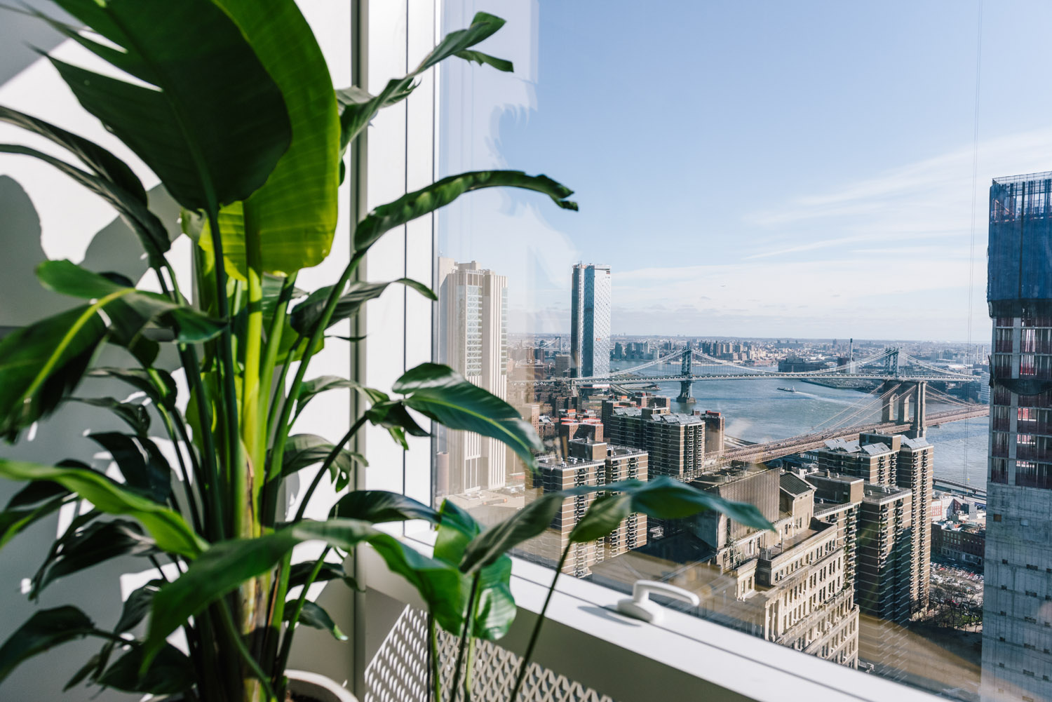
I like to think of it as the “3+ seconds rule.” Basically, the goal is to deceive people into thinking that your virtual background is a real environment for at least three seconds. And I’ve indeed experienced people asking if I’m in a specific city they recognized through the “window”.
How do we achieve this? First, choose a uniform wall behind you. It doesn’t have to be a green screen or a blank white wall, but it should be something uniform in color and texture, even if it’s a terrible choice of wallpaper or drywall. This will help with edge detection. I often noticed that people use virtual backgrounds or just blur out the image while sitting in a busy environment and get a terrible disturbing halo around their heads.
Next, avoid using abstract images as your virtual background. While they might look cool in theory, they can be distracting and cheapen the experience. Instead, try using photos of actual interiors. My lifehack is looking for great options on Airbnb or Houzz. You have actual interiors, these images are usually well-lit and visually appealing. Just find one that’s still beautiful without going into the “too much” territory. That giant glass ball over a canyon is probably too much, even if you’re already booking the place for the next weekend. Find something approachable.
Another thing to keep in mind is the lighting in your space. Make sure that you’re well-lit from the front, so your face is visible and not shadowed. You can achieve this by placing a light source in front of you. Now, you don’t have to buy a dedicated device for this, you can just use a lamp. And don’t have a window behind you.


