The Evolution of Outliners
Outliners are apps which force you to write in hierarhical bullet points, helping you to structure your thoughts They are are a very curious category of software products that have been mostly used by a small number of geeks but recently captured more attention with the launch of Roam Research.
Recently John Gruber asked on Twitter if anyone is aware of a good native outliner app for Apple platforms. There are two extremely tragic aspects of the reactions:
- There aren’t any.
- Most people don’t know what outliners actually are.
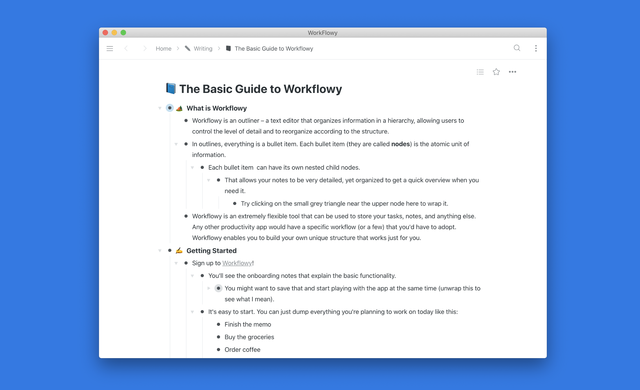
What Are Outliners
Outliners are a very curious category of software products that have been mostly used by a small number of geeks but recently captured more attention with the launch of Roam Research. Yes, it’s also an outliner.
An outliner is a text editor that organizes information in a hierarchy, allowing users to control the level of detail and to reorganize according to the structure (source). In outliners the bullet item is the atomic unit of information. Your notes can be very detailed, yet organized for a casual reader to get a quick overview. Certain apps add their own flare to this workflow but similar at their core. Examples include apps like emacs org-mode, Workflowy, Dynalist, OmniOutliner, Little Outliner, and Roam Research.
Why People Love Them
Outliners impose a very strict hierarchical structure that shapes everything you write. Paradoxically, they’re also extremely flexible.
- Outliners are great for note-taking because they incentivize you to structure your notes.
- Outliners are great for task management because they let you build what you need at any particular moment. Ordinary task managers impose a specific workflow: some have projects, some have areas, some have priority tags. And if you were to look at people’s outlines – they are dramatically different.
- Real life is often too messy to accurately separate quick notes from tasks. Outliners can digest both notes and tasks at the same time.
I noticed that any meeting notes I write in them immediately become better as I a) ensure that any bullet item covers one thought or an action item b) related notes are attached together.
But outlining isn’t just about writing in bullet points, you could do that in a Google Doc. You can also expand and collapse certain nodes along with their children to focus on what you need at the moment. Modern outliners provide additional features, such as allowing you to zoom on specific items and add tagging and filtering to enable a second dynamic hierarchy in addition to the core static one.
That makes outliners perfect for task lists. Despite all kinds of productivity and task management apps out there, I noticed that most of the executives I know end up just writing everything as a list in some note. Or maybe something slightly more complicated.
I’m still not sure if that is a sign of failure of all these apps or if this particular approach is truly the best and we just haven’t seen the app built to capture that. Outliners are close, Stewart Butterfield, CEO of Slack, has been a fan of Workflowy.
emacs org-mode
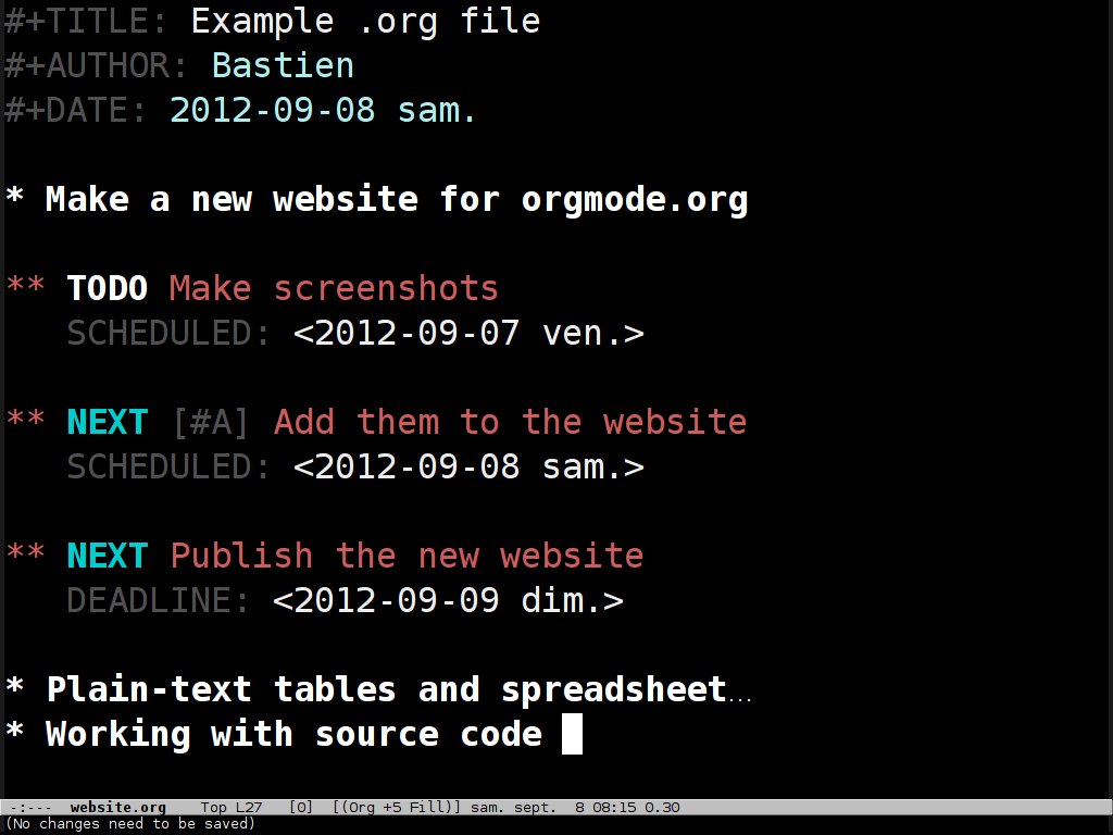
emacs has a document editing, formatting, and organizing mode called quite literally org-mode. Org-mode was created by Carsten Dominik in 2003, originally to organize his own life and work.
It’s very geeky and just like many DIY solutions popular among the UNIX fans is known for its quirks, steep learning curve, and issues with specific implementations. Yet people still use it and add new feature through plugins.
Omni Outliner
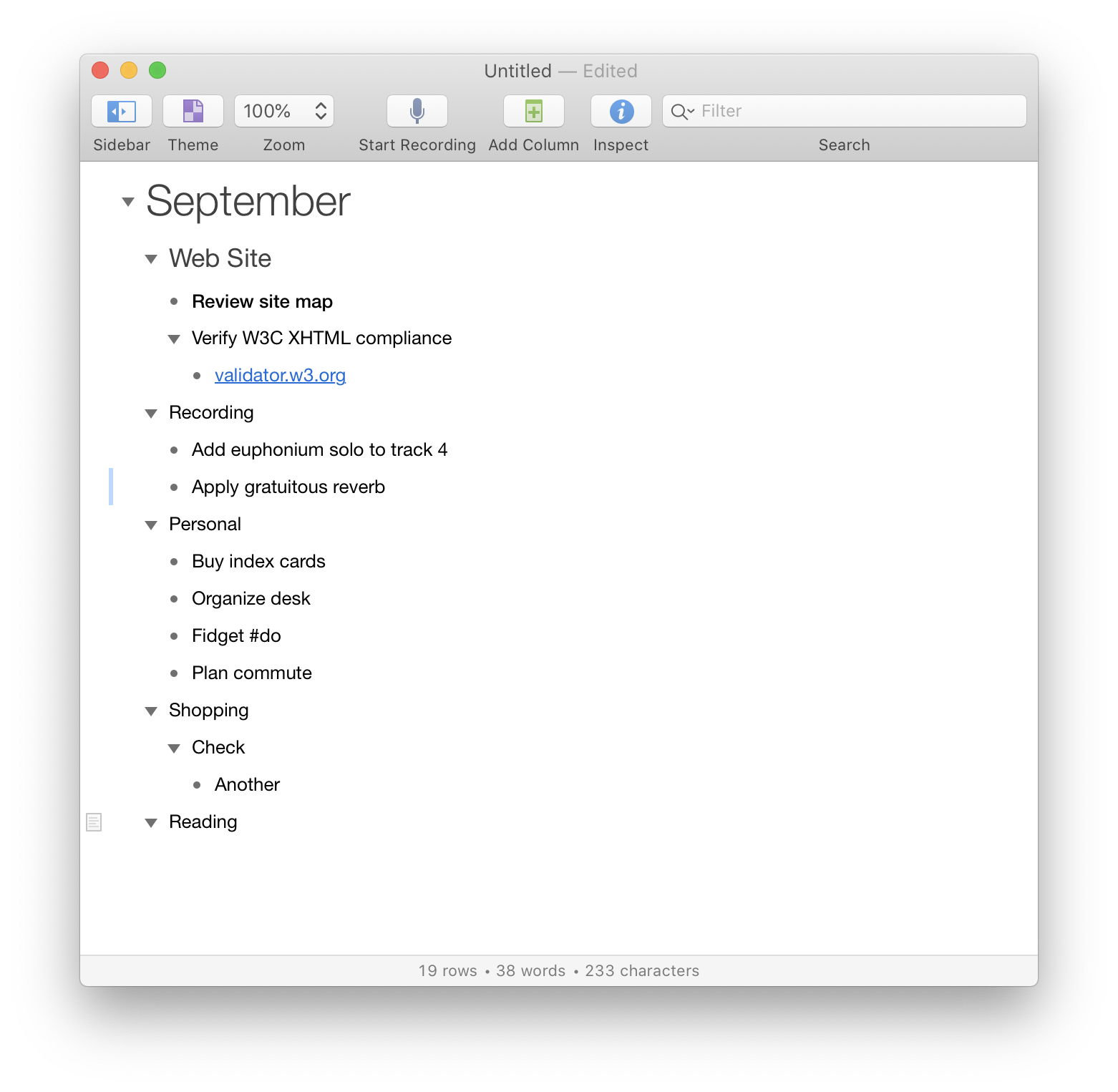 OmniOutliner is an outlining app for macOS and iOS created by the famous productivity masters at The Omni Group. OmniOutliner has most of the features of a conventional outliner and comes in two versions: Essentials and Pro. Essentials is heavily stripped down and available for $19.99. The Pro version is priced at $99.99 and has extensive customization options, section navigation, automation, and other features.
It’s more focused on actual lists keeping and formatting. Compared to many other apps in this list it’s what Pages is to TextEdit. And this is also probably the only outliner that has a good native iOS app. Unfortunately, it’s pretty classic and doesn’t have any tags or filters – even though OmniFocus, their well-known project management app, excels at these.
Workflowy
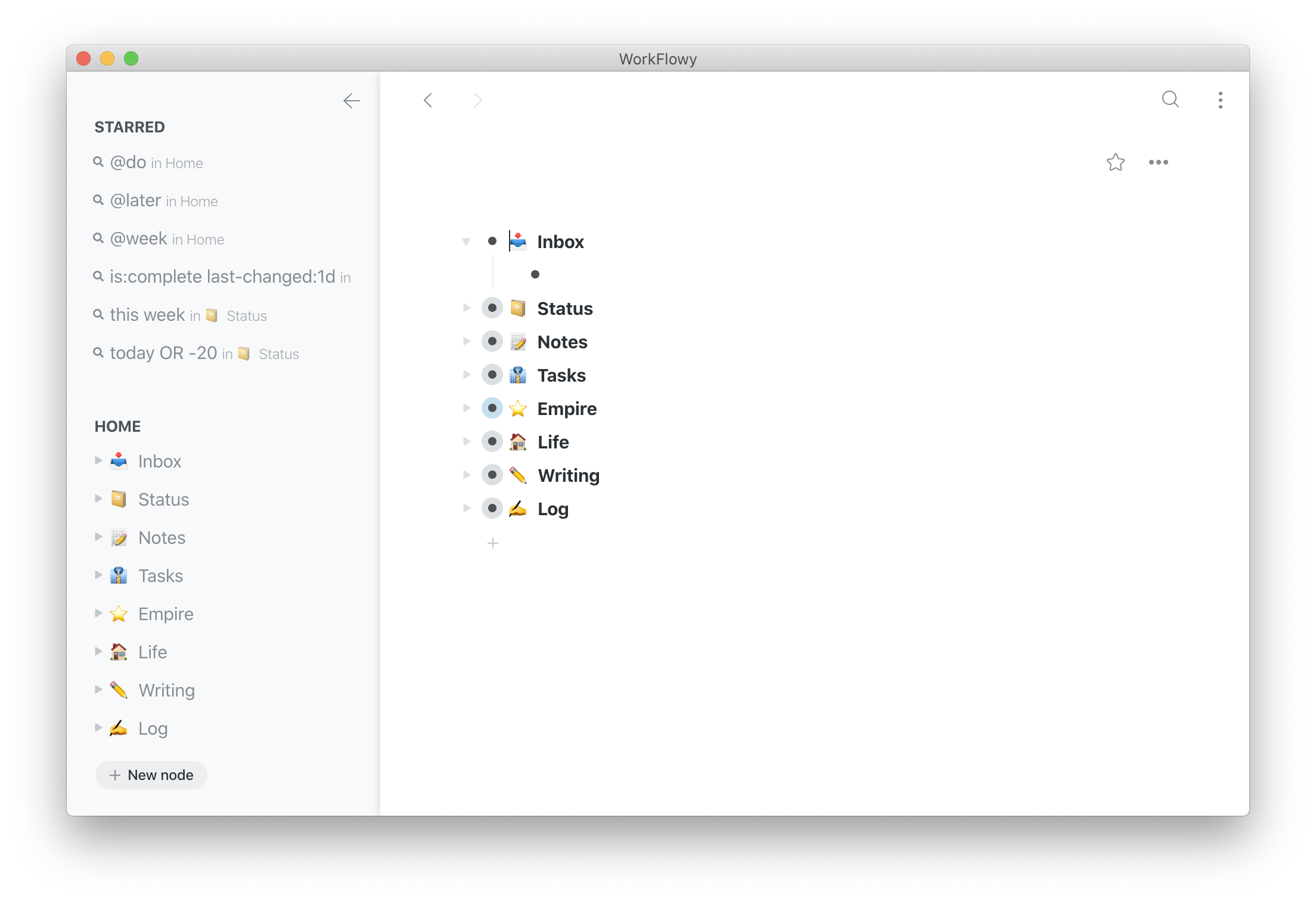 Workflowy is one of the most famous apps in the outliners space. It was created by Mike Turitzin and Jesse Patel.
Workflowy redefined the concept of the outliner in multiple ways.
- Workflowy threw away the old-fashioned file-based structure. You don’t create new files or folders in Workflowy, instead you have a giant infinitely-nested list. But you can zoom in on any node and focus on it and put the nodes you often need in favorites.
- Workflowy added tags and saved searches that allow you to filter nodes based and only surface what you need at the moment across the entire graph.
- More recently Workflowy added dates providing even more project management capabilities.
For a couple of years, the app wasn’t seeing any updates and that took a toll as many users tried to switch to something else. In 2018 the co-founder promised to make it better. Since then they launched new apps and added some long-requested features like the dates support.
Workflowy is my personal outliner of choice now. My project management workflow is based on a long tree of clients with all the stuff I need to do and check. I mark specific tasks with tags: @do for what I’ll be doing today, @later for non-urgent things, tags for individual team members to remember what I delegated, and dates when we have specific deadlines. Workflowy allows me to quickly switch context from observing everything we have on our plate to focusing on a single project or task. It’s also just helpful for organizing my thoughts – I wrote this post in Workflowy first.
Still, the development pace isn’t exactly where I’d love it to be, it’s tedious to add notes and tasks to Workflowy from other sources (no options to add via email or via share sheet) and the iOS app is a pretty obvious wrapper on top of the web version that doesn’t feel native. Workflowy also has suboptimal official manuals: you’re supposed to read the blog and for a lot of stuff the most recent records 4-7 years old are often outdated.
Workflowy’s free tier is pretty robust yet you can only create a fixed number of new nodes each month. Early users have it fixed at 250, new users only get 100 now. The paid version is $4.99 per month and $49 per year.
Dynalist
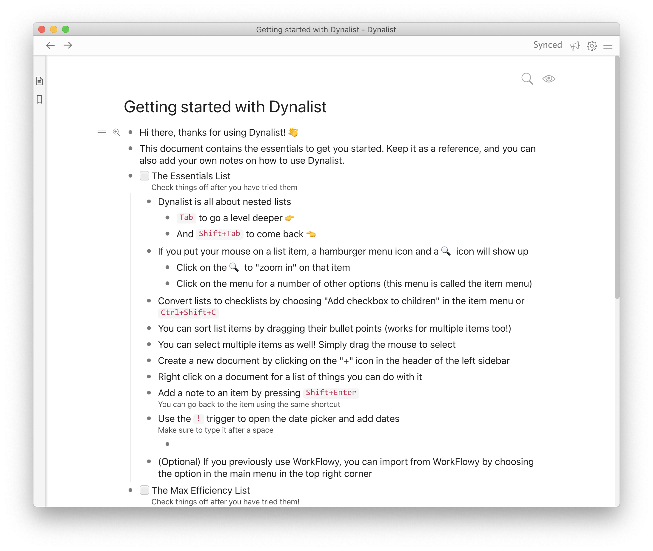 Dynalist was created in 2015 and was more of a response to the stalled development of Workflowy.
Compared to Workflowy, Dynalist has more advanced dates, attachments, version history, calendar integration, and a ton of other stuff. It also just gets so many things right and the pace of development is much faster. The app itself doesn’t look that polished and mobile apps are especially bad. They’re wrappers of the web version and aren’t good ones.
It gives more for free yet costs $10 a month ($96 a year) if you want advanced ones (and believe me, you want the ability to quickly jump between nodes from the keyboard).
The good thing is that both apps can easily import the stuff from the other one and you can simply test both side-by-side to understand which one you prefer.
Roam Research
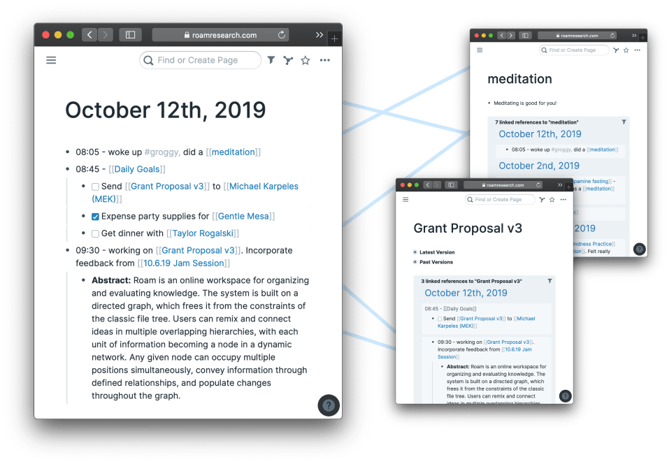 Roam Research is a “note-taking tool for networked thought” that has extended the feature set of a basic outliner by miles. It’s still an outliner and everything you type is a bullet-point. But the app doesn’t want you to create a defined hierarchy – instead everything is supposed to be dynamic. Roam allows creating new pages by just writing something inside square brackets (wiki-style), see backlinks (all the nodes and pages linking to the one you’re seeing right now), and block references (linking and repeating a specific node to provide context). The app wants you to build your own private wikipedia for your knowledge.
Roam Research has one of the steepest learning curves I ever saw in software. It allows you to do almost anything and that’s overwhelming. Thankfully, it has a very opinionated part of the workflow – “Daily Notes”. The idea is, instead of trying to find the perfect place in your hierarchy for all kinds of notes, you just type everything in the note titled with today’s date and add links and tags to connect those items. You can log your morning run, mention that you talked to a long-time friend, and type favorite excerpts from the book you read – and everything would magically fall into place. Roam also has some more unexpected features, such as Kanban boards, Pomodoro timers, and programmable graphs.
The app gathered a massive following – check out the #roamcult hashtag on Twitter. Roam doesn’t have a mobile app yet, its web version is relatively slow – it might take 20 seconds to open it for the first time but even then jumping between notes causes a noticeable delay. It’s also the most expensive at $15 per month.
What Follows
Maybe at this point Roam Research doesn’t have as many users as other outliners but it definitely has the most vibrant community expanding its ideas and coming up with usecases.
I believe it’s going to be beneficial for the whole space:
- More users get the concept while not everyone might need a powerhouse that Roam is.
- Other apps see the outlining approach validated and new features proven useful.
The team behind Dynalist has already added backlinks to their core product and even launched Obsidian, their take on a knowledge management app that’s based on local Markdown files. Since it’s not an outliner I won’t be talking about it much but you can read some of my thoughts here.
In my mind, the perfect outliner should nail the core workflow, have stellar tagging and filtering views, but also enable quick entry from other apps and services, moving the nodes around through keyboard and native mobile apps. I imagine it to be a mix of Workflowy and something like Things 3 taking the best of both worlds. If you ever stumble on something like that please send it to me.

