Browsers Are Outdated And Somebody Has To Do Something
Our browsers are astoundingly outdated and their developers seem to be oblivious to that. We went from basic HTML pages sprinkled with a little bit of Javascript to running full-scale applications like Figma or Descript yet browsers have practically the same UI as they had ten years ago.
Our browsers are astoundingly outdated and their developers seem to be oblivious to that. We went from basic Hacker-News-style HTML pages sprinkled with a little bit of Javascript to running full-scale applications like Figma or Descript – something you wouldn’t believe to be even possible in a browser ten years ago. The whole definition of the web browser changed – it’s not just something you use to “surf the web”, it’s where people often do all of their work: email, calendars, documents, design, even code with things like Github Codespaces or Replit.
Now, look at this Chrome from 2008 or so.
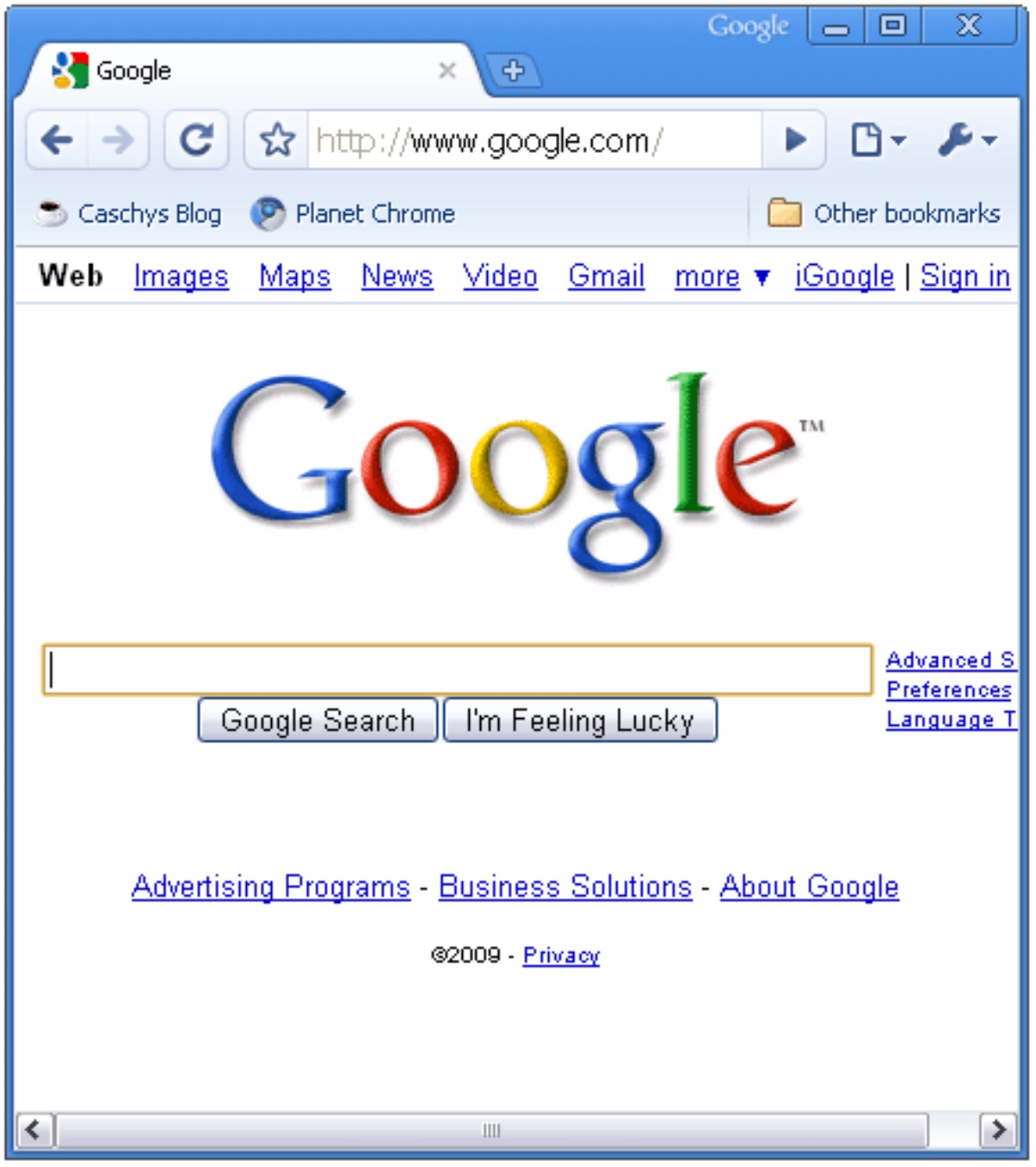
And now look at the modern one.
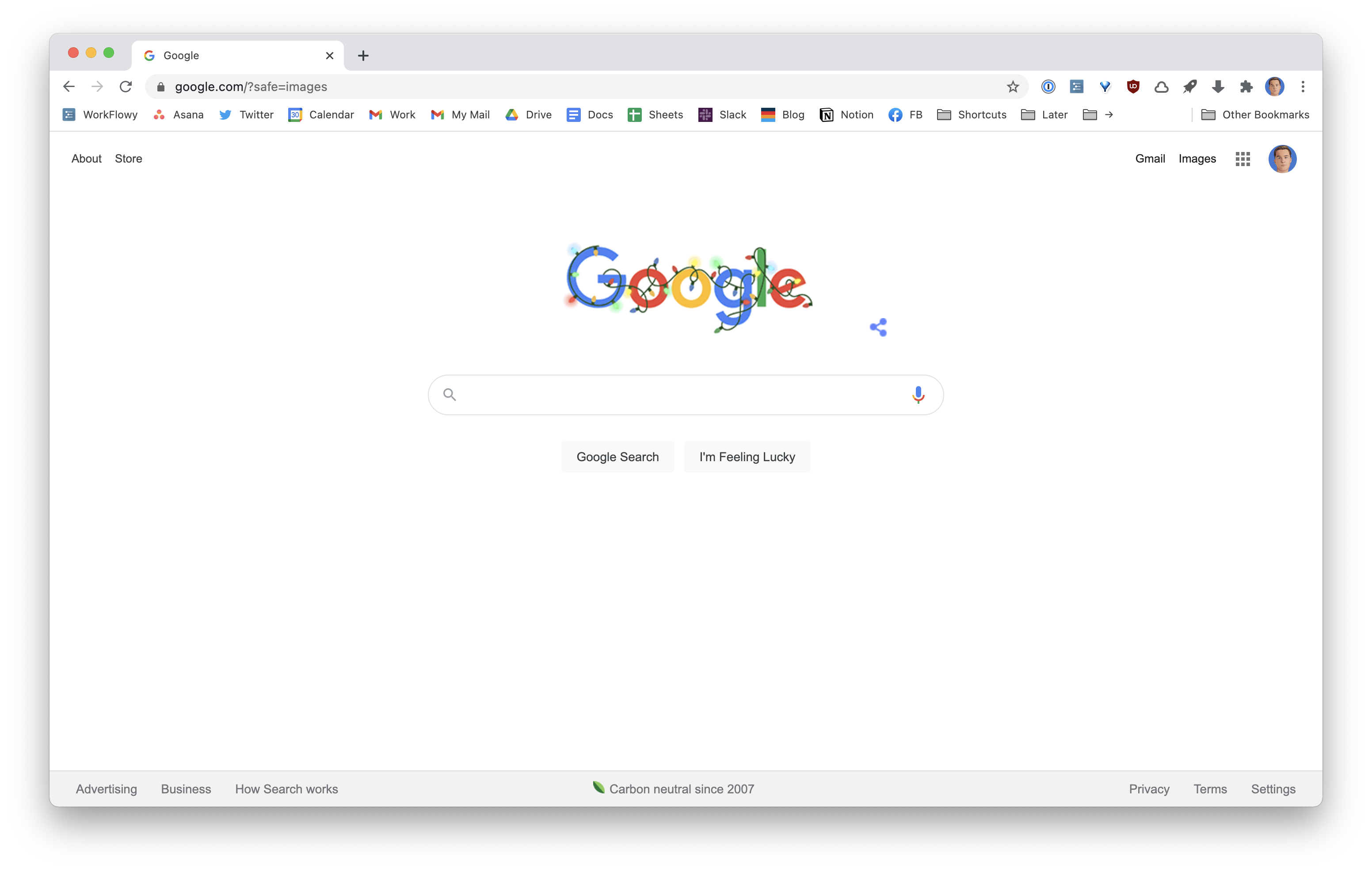
It certainly looks better. Yet the actual UI barely changed in all these years.
I’m mostly using Chrome as an example because it’s at least 57% of the modern web and is expected to be the most advanced but you could look at most other browsers and you’d see the same picture.
We went from web pages to web apps but the UI paradigm hasn’t really changed. Everything is a tab and all tabs are the same and each belongs to some window – which are also the same.
You can pin tabs. Most of the time I have 3-4 most important apps pinned right there and I’ve seen a lot of people do that. Still, they live in the same area and occupy the same shortcut space (Cmd-1,2,3,…,N).
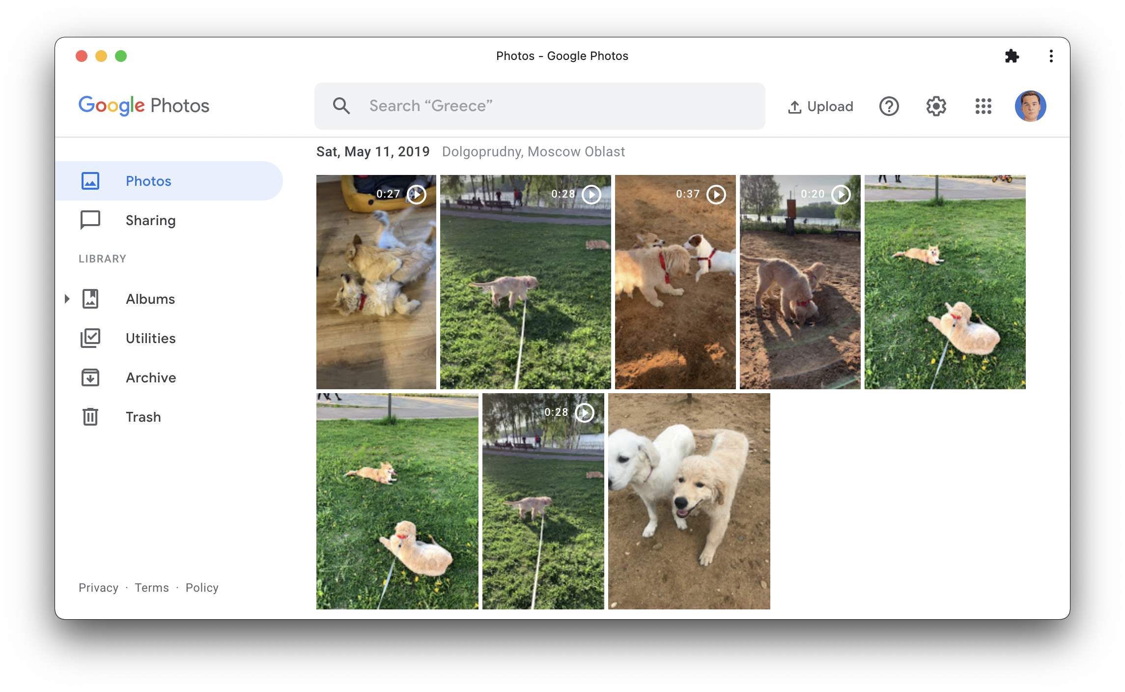
PWA and in-built Chrome’s functionality to “Install” apps could have helped. It creates a local shortcut for this webpage and launches as a dedicated app within your OS. But in order for the experience to be smooth you really need the app to be a PWA, otherwise, it’s too finicky for a regular user. For some reason, only a couple of Google services, such as Google Photos, are actually available as a PWA and look like a well-behaved local app. All of their most popular apps, such as Gmail, Calendar, or Docs don’t. Even if you “install” them, manually change the icon to look good, you’ll soon face issues, for instance, it’s impossible to change an account in Google Calendar without being thrown back to the browser. Google could have led us and turn all OS into literal launchpads for their own web apps would be highly beneficial but instead they dropped the ball.
In general, there are two distinctive ways people deal with browsers tabs:
- People who mostly have a few tabs
- People who have two hundred tabs at least
Personally, I’m in the first category as too many tabs immediately make me anxious. But I doubt browsers actually work well for the second category – or do anything about this scenario at all. Go hunting with your mouse or use shortcuts to switch between the first 9 tabs and left-right. There are extensions that help with it: from The Great Suspender that intelligently unloads the unused tabs to OneTab that helps you save sessions to things like Tabbs that just help you find anything in your browser. Unfortunately, most of these extensions are created by single developers, can be dropped at any moment and have terrible design (not all of them, but most). Basically, you’re at their mercy.
It reminds me of the way early Mozilla Firefox worked – its early versions were so barebones, you’d have to install extensions just to get you some basic functionality like saved sessions or downloads manager. I think we can expect more from our browsers in 2020.
Sometimes they give us an experimental feature that could really help, like recently added tab groups, but based on the past performance there’s no indication they’d continue working on it and provide an API to extension developers. Imagine if you could save a tab group for later, push any existing tab into a tab group you saved, if they could freeze automatically when you collapse a group so they wouldn’t take memory. If only.

In fact, these are the things I would want to be present in a browser:
- Advanced tab management functionality
- Session manager to quickly switch between different contexts
- Command menu to quickly switch between tabs and look up items in history
- Better support for proper web apps
You can achieve some of that with a combination of extensions but it’d all be supported with a duck tape and look pretty bad.
By the way, Reading Mode that Chrome added some time ago is a joke.
Solutions
In the past few years, I’ve seen a few attempts from venture-backed companies to create a new “browser” or augment the existing ones. Why venture-backed is important? Well, these are companies, not individuals, and they have enough cash to build out a product that might become financially viable. I’m not yet sure most of them would be able to justify venture-scale returns in the end though, except maybe a few.
Mighty
Mighty is a cloud streaming for Chrome. You can buy the lowest-end MacBook Air and then casually browse 500 tabs filled with heavy apps with no issues. Our laptops are highly optimized for video streaming so it should last long and eat way less RAM.
Initially, I thought it was a weird idea, but then I realized that a) we all work in web browsers b) if you solve Chrome streaming, you solve streaming for any app.
Mighty is in limited access right now. I haven’t tried it but as far as I know they add a few niceties here and there to make Chrome a bit better. Maybe in the future they’d heavily upgrade it as they had to fork it anyway but we don’t know yet. I suppose it doesn’t actually solve the issues I’ve been talking about but would solve the innate “heaviness” of Chrome.
Browser Company
The elevator pitch for the Browser Company is exactly about building a new modern browser from the ground up. They are very early so you can only see certain experiments they showcase from time to time.
Despite the ways our internet use has evolved, the browser has remained relatively unchanged. While all of our other software tools are changing for the better—with more collaborative features, flexible interfaces, and powerful functionality—the browser largely still does what it did twenty-five years ago.
That’s why we’re building a new browser—we believe it could do so much more to empower us. We’re imagining a browser that can think as quickly as we do, take work off of our plates, and pull our creativity forward. A browser equipped for the way we use the internet in 2020, and foundational for how we hope to use it in the future.
Building a new browser is insanely hard. They are extremely complicated apps. Even if you just fork Chrome and try to add some UI you’d likely fall behind very quickly. I’ve been using Edge for some time and it already falls behind Chrome in a few areas: no rich audio control, tab groups can’t be collapsed, etc.
Station
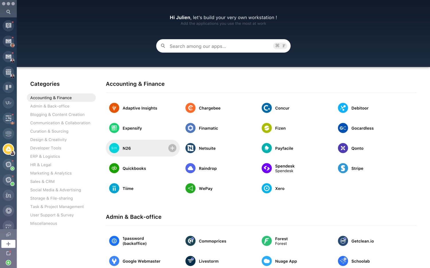
Station started as an alternative to browser – a command center for your web apps. Its biggest advantage was that tabs were tied to an app so you could have a hundred of them opened and you wouldn’t even see that. Also, things like being able to quickly switch between accounts in a more reliable way. Station was built on top of Electron, a framework developers use to bring web apps to the desktop. Each app or service has to be added to Station directly by the team. On top of that they had to rebuild all the features users would expect in the browser.
With time the developer realized it was a dead end. Users liked the concept but the performance was pretty bad so they’d churn. The team made a heavy decision to drop it completely and turn Station into a regular Chrome extension. Now they don’t have to recreate the entire browser but at the same time they don’t have control over it and their functionality will be forever limited by the APIs provided to them. Also, I recently switched to a new MacBook with M1 inside it, but on my previous Mac it was insanely slow and I couldn’t use Station at all.
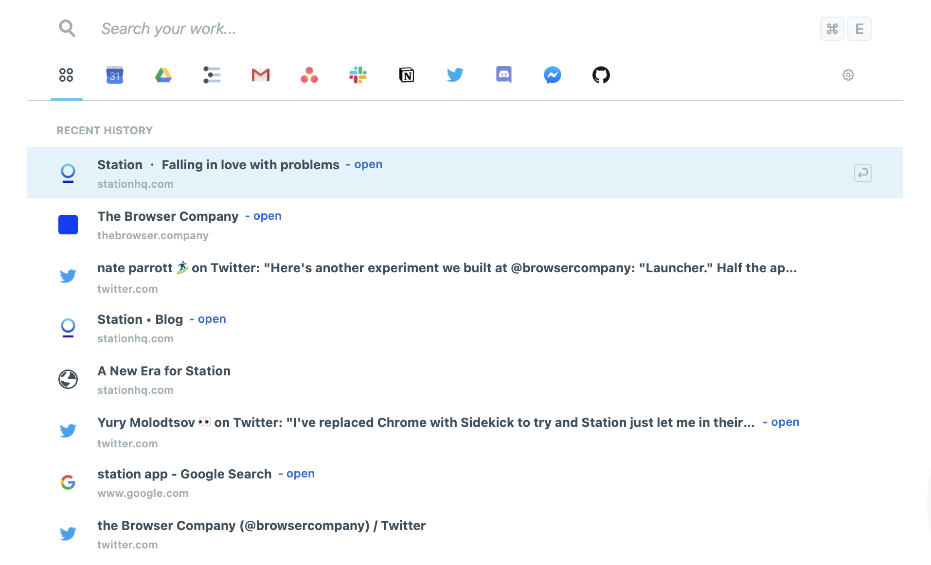
There have been a number of similar apps such as Wavebox, Shift, and a bunch of others. I think the ones trying to rebuild the browser based on Electron won’t have much luck. It just doesn’t make sense if people still have to use another browser and it’d be quite hard to catch up.
Building a new web browser from scratch using a framework (Electron) that was never designed to do it meant iteration cycles were slow. Very slow. We were not learning fast enough. On top, we had to build features you simply expect as standard in a browser and fix bugs that users wouldn’t typically experience in a regular browser. That taught us nothing at all.
Workona
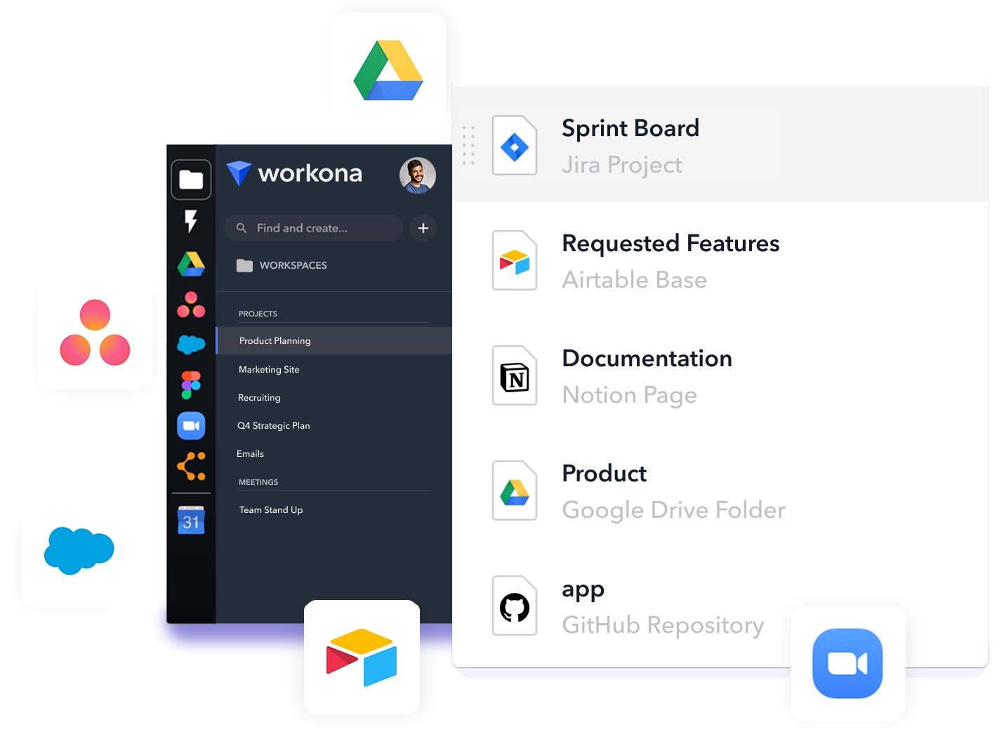
Workona is a Chrome extension that adds deeper integrations with apps and enables search across their histories, proper sessions and tab management, as well as collaboration features for teams. It also faces all issues of being a heavy extension replacing the new tab – on weaker machines it’s a bit unpleasant to use. When I was using it, it also had limited integrations with apps – it couldn’t really do more than search your browser’s history for a respective domain.
Sidekick
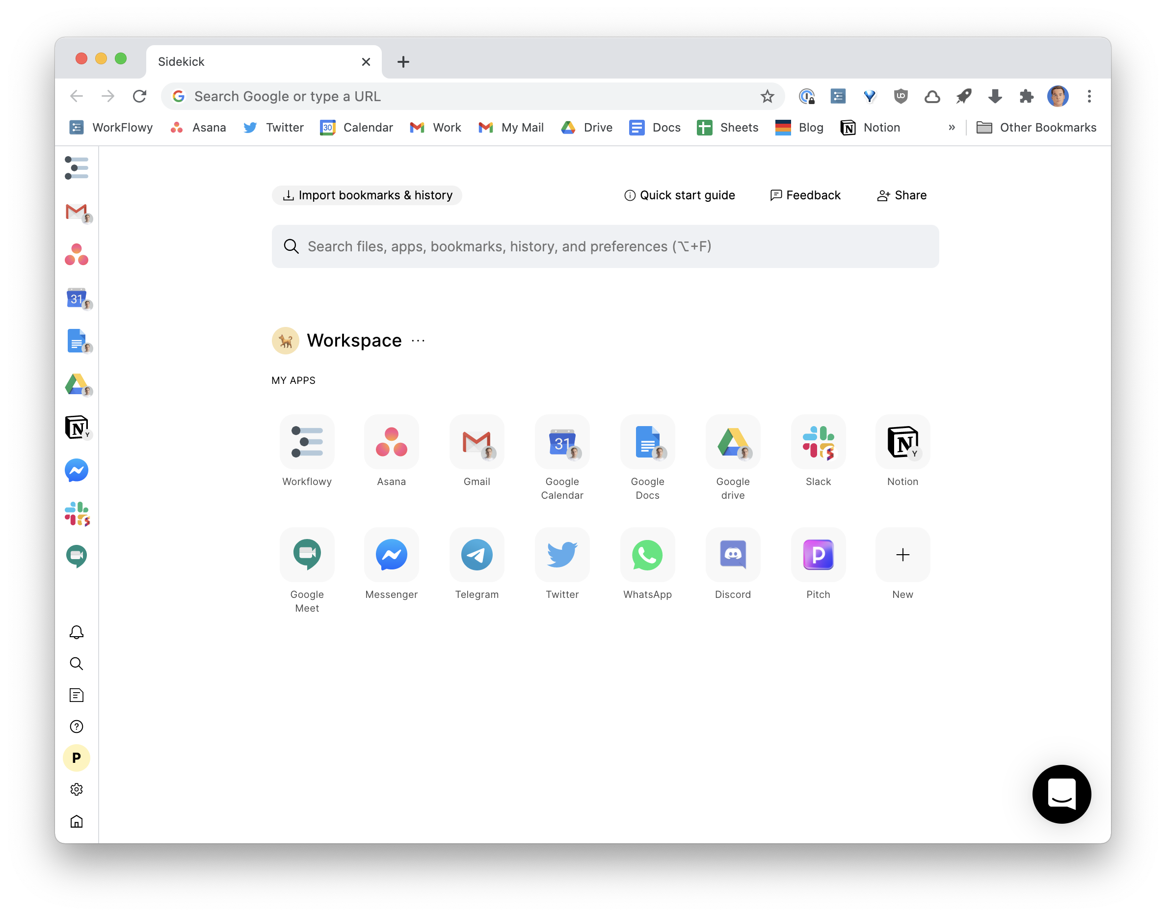
The team behind Sidekick decided to outright fork Chrome. That allowed them to perform far deeper modifications and keep it quick.
- Sidekick has a separate apps bar on the left that is visible on all pages. So if you always want to have Gmail, Notion or Calendar open you don’t have to keep them pinned and constantly stumble upon them. They’re here.
- Sidekick has a very powerful search across your history and open tabs. If you want to open a document, a Slack channel, or a Figma mockup it’s likely you opened it before – so they can provide a ton of value by just surfacing your history items.
- Sidekick has user sessions and you can quickly switch between contexts. At the end of your workday you could just switch to a personal session and have a clean slate, while all your countless work tabs are safely preserved.
- It has some nice additions such as an embedded ad & tracker blocker and ML-enabled tab suspender to save RAM.
- What’s also important is that their modifications are rather limited. You can enable Chrome syncing and other Chrome instances would believe it’s a regular Chrome, so you can send a tab to it from mobile, for instance. Still, the features may lag behind, it doesn’t have a build for Apple Silicon, for instance.
I really hope we will soon see ever more significant advancements in the browsers’ UI.
Upd. Based on the feedback I’ve adjusted the description of Wavebox as it’s not an Electron app but a Chromium fork.


