Yury Molodtsov

COO and Partner @ MA Family, where we run communications for tech companies.

About Me
Twitter ↗
Threads ↗

← All Posts

Posts tagged apps

Raindrop Review: Better Bookmarks For Twitter And YouTube

March 26, 2023

Twitter, YouTube, and many other services have built-in bookmarks and playlists encouraging you to save content for later. I encourage you to try using a third-party service instead of them. Raindrop is a great alternative.

Platforms want to lock you down, and it’s easy to save everything right there, but you will likely end up with an endless stream of saved notes you will never revisit.

The main problem with Twitter bookmarks is that they are not very user-friendly. It is difficult to find the tweets you have bookmarked, as they are not organized in any manner. There is no way to search for bookmarked tweets, making it even more difficult to quickly find the tweets you have marked for future use. And most importantly, if the author deletes the original tweet, you will be left with nothing.

YouTube playlists have similar problems. Yes, YouTube provides you with folders, and you can use playlists as intended, although I wonder how important that functionality is. But if the video is deleted, you won’t even be able to figure out what it was, as there’s no title. And you can’t search through your playlists.

Enter Raindrop.

Raindrop is an all-in-one bookmark manager that lets you save any pieces of content, from links and entire articles to tweets, YouTube videos, and separate images. You can organize everything with folders or tags. On top of that, Raindrop provides a powerful search. It can even be used as a read-later app.

If you pay for the subscription, Raindrop will parse all text from saved pages and save a permanent copy – forever. Even if the original website is gone, you can still access it.

All of that functionality allows you to bookmark tweets and YouTube videos, organize them, and find specific pieces via search.

Raindrop has great apps for the web, Mac, and iOS. You can save anything with a public link using browser extensions and iOS share sheet. That is an important limitation. Instagram is probably one of the largest offenders with its “Saved” functionality. Yes, you can save a link to an Instagram post, but Raindrop won’t be able to parse anything via this link or save any descriptions. That’s why I don’t like when people share recipes on Instagram – but you can save everything manually if you are willing to spend more time.

I find Raindrop extremely useful for saving any kind of guides, tutorials, great services, and utilities I might need one day, libraries of content, and design mock-ups – everything I don’t need daily but might require later. Even its free version is extremely capable.

***

Raindrop gives you control over your bookmarks, allows you to export them if needed, and integrates with Zapier if you want to build a complicated workflow. You can even share collections with a public link accessible to anyone.

Comment on Twitter
productivity
apps

How to Read Newsletters In An App

March 25, 2023

Media publications and individual authors have largely moved to email newsletters, the only semi-direct which is accessible to regular users and doesn’t leave them at the mercy of Facebook or Twitter. Yet email apps haven’t really caught up to this (with a few notable exceptions, such as Hey and Big Mail). They force you to read long written pieces in the same interface as that cold intro from Chad.

You might be too busy for a few weeks, and then you end up with hundreds of emails, causing fatigue as you feel overwhelmed by their sheer number. Or you might be getting too many of them every day. Also, not every issue might necessarily be interesting for you. And ultimately, hunting for this small grey Unsubscribe link isn’t fun at all.

Thankfully, there are better alternatives. You just need to use another app.

***

How to Collect Newsletters

If you’re using Gmail, one thing I’d encourage you to do is to use aliases for email newsletters. Meaning if your email is name@gmail.com, use name+news@gmail.com to subscribe to any newsletter. Then you’d be able to create rules based on this address to quickly categorize, mark or forward them and adjust your workflow on the fly.

Sometimes newsletters won’t let yo use an alias, but it doesn’t happen that often. So far I’ve only seen Morning Brew do this.

What options do you have for reading emails? Some of them are single-purpose; in other cases, you have an app that can host your newsletters in addition to its core functionality. It might be a good option if you’re using one already.

Feedbin

Feedbin is a very powerful online RSS reader. It allows users to subscribe to various news sites and other content sources and automatically receive updates when new content is posted. Most importantly, it gives you a personal email address you could use to forward all of your newsletters into Feedbin and read them there right along with your RSS subscriptions. Feedbin is $5 a month, and it’s a great service overall.

Feedbin has a very powerful web version and good mobile apps. But you can also use a third-party RSS app to connect to it. Although reading newsletters will be a bit less pleasant this way – most RSS readers will try to parse newsletters, and results may vary.

Other RSS readers, such as Feedly or Inoreader, also provide similar functionality on their more expensive tiers.

My review of Feedbin is here.

Mailbrew

Mailbrew is an email curation and newsletter subscription tool heavily inspired by Hey. Forward your newsletters to Mailbrew, and then you will have an interface very similar to The Feed. You can also build custom weekly and daily emails that could deliver digests of fresh newsletters to your inbox so you can choose which ones you want to read.

I use this approach now, and I find it quite useful. Here’s why:

  1. You can see the beginning of each newsletter issue and can decide if you want to open it and read the full content.
  2. There’s no need to archive or mark previous issues, so less fatigue.
  3. You can also quickly share a particular issue with someone simply by using the link.
  4. Mailbrew remembers where you left off.

Since Evan Williams bought Mailbrew, it became free, but I suppose we can’t be sure of its future.

My review of Mailbrew is here. It was updated since, but the core features are pretty much the same.

Readwise Reader

Readwise Reader is an app that helps people save and review the highlights and notes they take from books, articles, and other sources. It also allows you to subscribe to RSS feeds and process newsletters in a single interface.

I’d recommend you be careful about signing up for many authors and publications using Reader, as it can quickly become overwhelming. Also, it tries to process newsletters into text, and sometimes it might not work that well, especially on heavily formatted pieces. But it’s a good option for a few key writers you always want to read. And you get all other features: highlighting, tagging, it remembers where you left off.

Reader is my favorite read-later service at the moment, partly because it’s great and partly because it’s natively integrated into Readwise, which I used even before. The cost for Reader hasn’t been announced yet, but the full Readwise subscription is $7.99.

My quick review of Readwise Reader is here.

Matter

Matter is a modern clean-looking app that focuses on helping you follow your favorite writers wherever they read. In addition to traditional publications and RSS feeds, this includes email subscriptions, like Substack or anything else. Some of the features you’d likely need are behind an $8/month subscription. In addition to the mobile app it’s also available on the web.

I previously covered both Reader and Matter as read-later apps, and this article remains useful. While Feedbin is a more traditional RSS reader that can handle other stuff, Matter is like a modern version of Pocket/Instapaper, while Readwise Reader is something between a reading list and a research tool.

Stoop

Stoop is a mobile app designed specifically to help you read newsletters. This is the one option I used the least. The entire experience is very mobile-focused, but they also have a web beta now.

I have concerns about Stoop as it seems their iOS app hasn’t been updated in two years. Seems it’s still working, so I thought I had to mention this as an option.

Stoop costs $10 a year.

Comment on Twitter
productivity
apps

How to Start Your Blog in 2023

February 19, 2023

Running your own blog in 2023 is still needlessly complicated, especially if you have any kind of taste. Why have one in the first place? This particular blog is more like a series of essays I wanted to get out. I also have another blog which is more like an online journal of my life. I was never able to have an actual journal on paper or use apps like Day One. But when it’s online, and other people can see it, I get an incentive to share more, even though I still mostly write for myself.

Social apps and networks are obviously the easiest options, but they’re geared toward vastly different things, and I just don’t trust their longevity. Having your own platform enables flexibility and portability, so your content can be kept online practically forever.

There are many options out there, ranging from WordPress and Ghost to static blogs to managed online platforms and Micro.blog. How do you choose between them?

First, here are things I’d like to have in the ideal world:

  • Modern and minimalist yet functional design
  • Markdown support to ensure the content is portable
  • Accessible via mobile
  • Photo galleries for particular posts and the blog itself
  • Email subscriptions
  • Affordable enough, so you don’t care about running it forever
  • Effortless backups
  • Connected to your personal domain

Turns out, it’s hard to find all of these things combined. Pricing is important to me at the ideological level. I can afford to pay $10+ a month, but I’m more likely to start wondering if I need to continue unless I suddenly have a very popular blog on my hands.

In fact, none of the options out there seem ideal to me – they range from mediocre to acceptable. Especially if you want anything more than a series of relatively long text-focused posts. Choose the one you like the most and stick with it as long as possible.

WordPress

The most popular CMS in the world, and yet I just can’t stand its admin page. Generally, WordPress can fit most of these requirements, but the paid hosted options are usually slightly more expensive and geared toward professional bloggers and content creators. Well, they’re targeted at businesses that can mentally afford to spend much more.

WordPress even supports Markdown and has countless plugins for photo galleries. The basic tier is €8 unless you pay annually, but it doesn’t include backups – for those, you’d need to pay €25 a month for the Business subscription.

The look of most WordPress blogs is just very dated and immediately recognizable. Of course, there are thousands of themes, but very few were meticulously designed, and building one yourself is no easy challenge. And you’ll need to self-host or pay for the higher tier again.

Webflow

Webflow is fantastic for corporate blogs as it allows managers to adjust not just the content but the website itself quickly. But such blogs aren’t really portable, and the CMS tier is quite expensive, so it’s not a great option. I’d skip it.

Ghost

Ghost is basically the modern WordPress in terms of its prevalence. Ghost is much more simple and straightforward, yet it comes at the cost of customizations. More recently, the platform has shifted its focus toward paid communities and newsletters. While it’s still possible to simply run a personal blog, Ghost’s official catalog has about two or free themes that fit this purpose, and it became even harder to find something suitable with modern updates like dark mode. And it’ll be bugging your readers to subscribe with an annoying button. And you can’t really change any major settings or adjust the website in a major way.

But if this particular look works for you, it could actually be a great option. Ghost is likely to stick around, supports Markdown (in a more convoluted way now). Also, please note that their support on mobile is intermittent at best, they had mobile apps working a few years ago but it doesn’t seem to be solid right now.

Ghost was known for the high price of their managed instance at $25, but recently they introduced a new Starter package at $9 (these prices are for the annual tier). But the Starter package is even more limited in terms of options, such as themes.

Thankfully, just like WordPress, you can run Ghost on your own instance. Most people recommend a $6 DigitalOcean droplet (plus the price of backups).

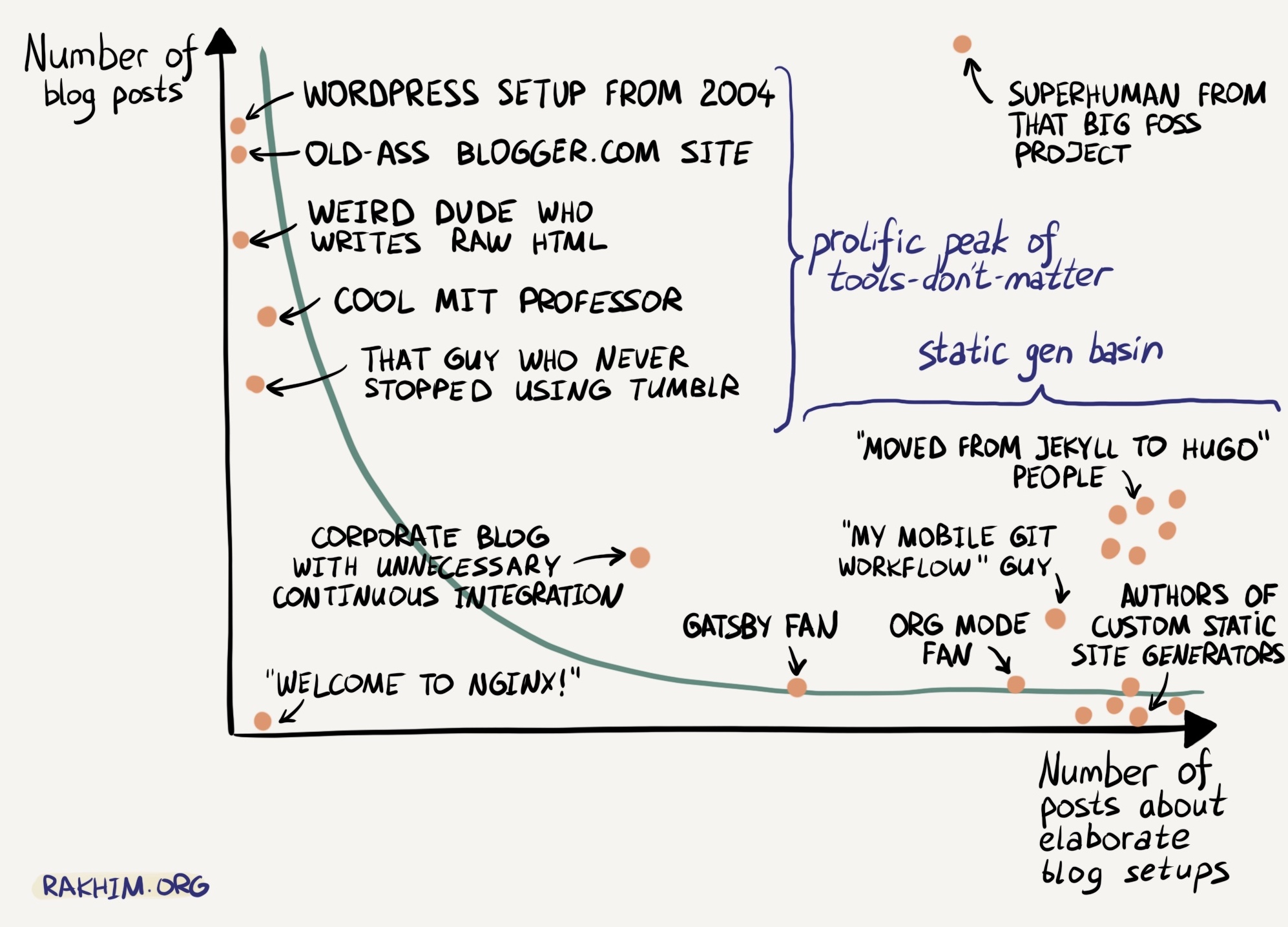
Hugo and Other Static Blogs

Static site generators (SSG) compile your content and design into static HTML pages that can be easily served online with minimal effort. Hugo is probably the most popular right now, but there are also Jekyll, Gatsby, Hexo, VuePress, and others.

With SSG you usually keep all the content in a GitHub repo and use Vercel, Netlify, or GitHub Pages to compile and serve the website. This isn’t the most consumer-friendly option, and it definitely helps to have developer experience. But this enables effortless backups.

There are a few ways to write content with SSG. The most low level is by writing Markdown directly using any text editor and making commits to GitHub. You could technically even do this on iOS with certain apps. If you also want to upload images for your posts, this immediately gets complicated. People often recommend content management systems that run on a third-party service, let you write posts and publish them, such as NetlifyCMS or Forestry. In my experience, they are quite clunky and certainly not mobile-friendly.

Email subscriptions are hard to set up, although you can use a third-party service like Buttondown or MailChimp to serve emails based on the RSS feed.

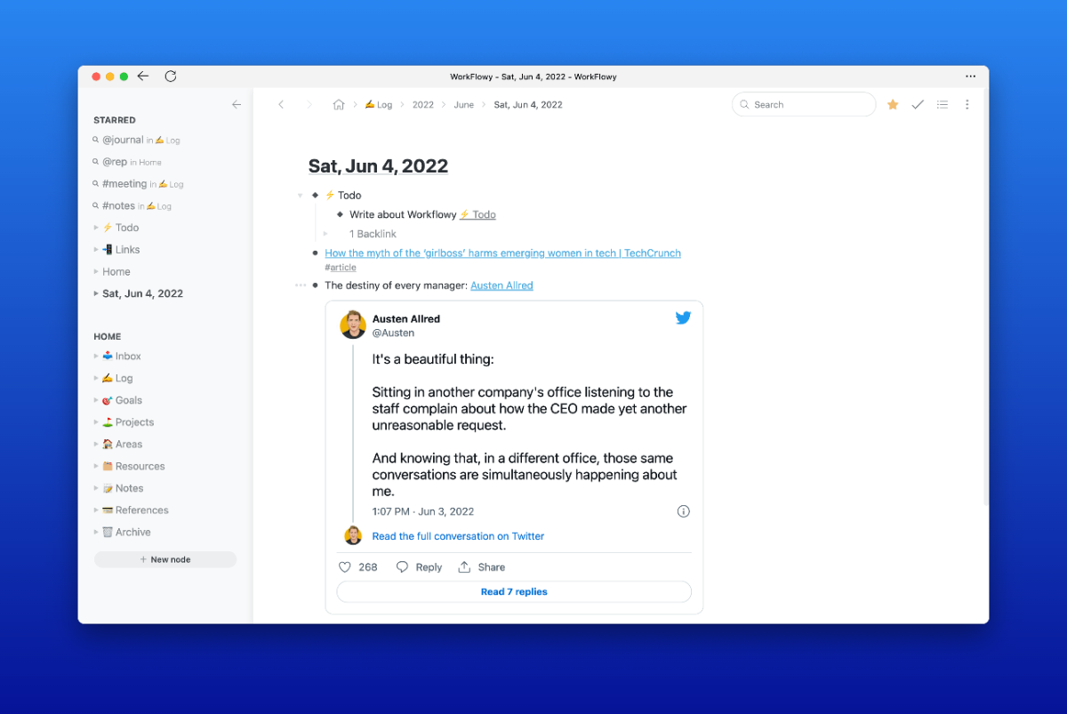
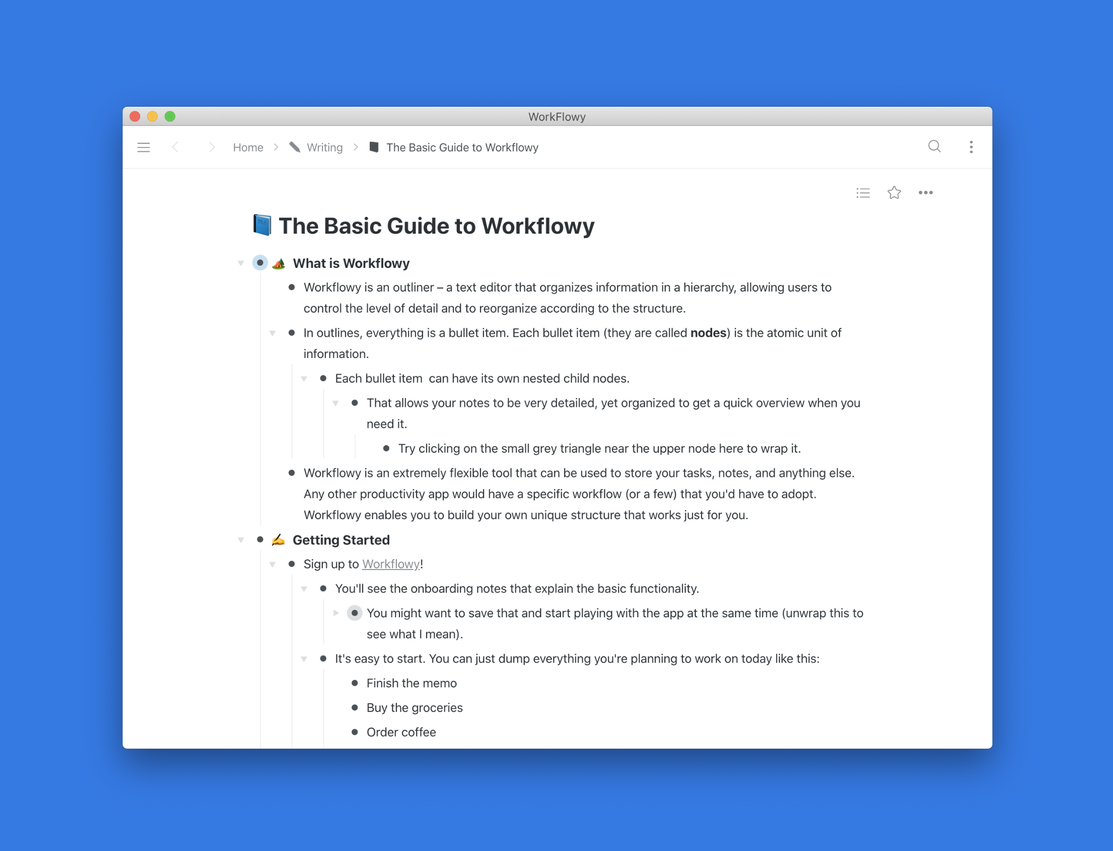
FYI, this blog runs on Hugo and Forestry but this only makes sense because I don’t post too often. To me it simply was the most straightforward option which gave me the most control and fantastic portability in case I switch to another platform later.

Micro.blog

Micro.blog is a service for microblogging combined with a social platform. In fact, it runs on managed Hugo instances coupled with an online CMS, mobile and desktop apps, and an ecosystem of other apps and services. You also get access to a social layer of Micro.blog’s users who can leave comments and respond to your posts.

Micro.blog costs at least $5 a month. You can participate in the community for free and broadcast your posts from other platforms through RSS or ActivityPub, but hosting is only available on paid plans. The top $10 plan also gives you email newsletters and digests of your content.

The apps aren’t perfect, and the experience is sometimes a little bit rough, but it’s one of the best options for your online journal. Imagine having your own private Twitter, Instagram, and a long-form blog on a single website. That’s Micro.blog for you.

If something happens to Micro.blog as a project or if you want to leave it, you can always just deploy your blog as a standalone Hugo instance. And it allows you to tweak basically anything in your blog.

My other blog actually runs on Micro.blog because I post more often and quite often use my phone for this. Just like with plain Hugo, I had to intervene in the underlying code quite a few times to make it work nicely for my goals.

Tumblr

Tumblr, a once popular social network, is now also owned by the same company as WordPress. In my opinion, it was always an underrated blog platform, specially tailored to personal online journals.

Tumblr blogs are very customizable – in addition to choosing a theme, you can edit its code directly. And it supports a range of different post categories: long texts, images, quotes, etc. Finally, it’s free and, to my surprise, allows you to connect your own domain. Email newsletters are only available if you serve via a third-party service and RSS.

Any disadvantages? People will know it’s a Tumblr blog.

Substack

Substack positions itself as the newsletter platform, but at the end of the day, you still have a website with posts. The design is basically standardized and very recognizable, and your readers are constantly pushed to subscribe to the point of churn.

Also, there’s the very question of the kind of content people expect on Substack. I’ve seen some people using it for their personal blogs, but they’re certainly in the minority.

Managed Platforms

There are several less popular managed platforms for personal blogging, such as Write.as, Proseful, Blot, Bear, and others.

Most of these are projects led by enthusiasts, so there’s always a good chance they will get tired and have to sunset the platform. This is a risk that you have to always keep in mind and think about backups and export options.

Write.as and Profesul are both simple and stylish blogging platforms. Write.as has a dedicated Snap.as project for photo galleries. Bear promotes itself as the most minimal blog platform. And Blot can look very different but deploys from a Dropbox/Drive folder or a GitHub repo. Unfortunately, in my experience none of these tools are truly polished, you’re facing rough edges all the time.

***

Figure out what features you definitely need and which ones are just nice-to-have. See what is used by the blogs you like and follow. Although you might end up surprised with their technical choices, but it’d still be a good reference of what you might be able to achieve with each option.

Having the right tool certainly helps, but at the end of the day, what matters is what you write there. Focus more on the content and just ensure the process of writing and posting is simple enough.

Comment on Twitter
productivity
apps

Switch to a Modern Read-Later App Already

December 14, 2022

Read–later apps are simultaneously popular and outdated. A lot of people use them. They’re now embedded right in our browsers and there’s a couple of age-old names, but if you’re still using any of these options you should reconsider.

Safari introduced Reading List back in iOS 5. It has barely seen any updates. Chrome is still to offer a consistent user experience on different platforms – try syncing your saved pages to Chrome on iOS.

Pocket and Instapaper have been household names in that space and have practically created it. Pocket was bought by Mozilla in 2017, Marco Arment sold Instapaper in 2013. Both apps haven’t been improved in any major way in recent years, yet still want to charge a subscription to access locked features.

If you’re using any of these apps, you don’t know where the industry edge is. Here are some of the common problems they have.

Bad text parsing

The most important part of a read-later app is actually parsing articles to produce a clean-looking page. In the ideal world, it should be able to handle not just webpages, but also PDFs, tweets, and arbitrary links well.

Hard to process

Reading is great, but the app should help you preserve the knowledge. Notes, highlights, categorization – and a way to extract and recall all of this. You think of these apps as your ultimate storage of knowledge, but it’s just an archive of articles you will never open again.

Doesn’t help you read

One of the common problems people experience is they eventually turn their read-later app into a dumpster filled with old stories they never bothered to get through, start feeling bad and simply delete it. A perfect app helps you find what you can read at any moment or archive if it’s not really important. Or turn an article into a podcast you could listen on the go.

I have used two options I wanted to tell more about.

Matter

Matter is a modern, clean read-later app that started as a social reading service and then pivoted. It has a great parser and augments Chrome (and Chrome-based browsers) with a much better reading mode (Safari excels here). Has options to export your highlights to Readwise and Notion. Available only on the web and iOS for now. They’ve just announced their pricing, which will be $8 a month to access advanced features: ​​HD text-to-speech, fluid highlighting, and note-taking, integrations, full-text search. In my opinion, these are essentials, but you can definitely use the free version as well.

Readwise Reader

Readwise is a service that collects all the highlights you left in Kindle, Apple Books, and various apps to send daily or weekly digests and remind you about the stuff you read and found important or interesting.

Readwise built Reader, their take on a modern read-later app, and this became my go-to option. This is a great business move, as it increases the value of Readwise itself (which I previously paid for already) and reliably locks me in.

Reader is an omnivore. It takes webpages, tweets, PDFs, you name it. Then you read, make notes, and leave highlights, which end up in your storage and regularly get surfaced back to you, along with anything you read in books.

The app makes reading feel like work, but the kind of work you enjoy. Almost turns it into a game. Reader has an extremely customizable home view to help you choose the next thing to read. Or save for later and avoid the clutter. They’ve also integrated GPT-3 to summarize texts or let you ask questions about their content.

The cost for Reader hasn’t been announced yet, but the full Readwise subscription is $7.99.

Other Options

There is a few other apps I’d suggest trying out in case you’re not the fans of two preceding options. The one I heard about just recently is Omnivore. It seems to be open source and the core features are free. Hope they will build a good business out of it. If you’re fully committed to Apply, you might try GoodLinks. It’s a pretty good app, but all integration should happen on device and there are no higlights.

***

Honestly, at this point, it doesn’t matter much. At least stop using Pocket or Instapaper. The new apps have been getting so much better.

Comment on Twitter
productivity
apps

Workflowy is the Platform to Build Your Ideal Notes System

June 4, 2022

Time and time again, I’m getting back to WorkFlowy as my primary system for notes and knowledge storage.

It is truly a bicycle for the mind that helps you structure your thoughts while providing unparalleled flexibility.

A lot of people write down their tasks and notes in plain text because it’s an easier input system that gives them flexibility unmatched by task managers like Todoist or Things 3. I’ve seen people using anything from Apple Notes and Google Keep to a draft email in their Gmail web interface.

Outliners like Workflowy are an alternative. They are flexible and powerful enough to augment your workflow.

You can jot down your thoughts, notes, and tasks, but unlike, say, Apple Notes, Workflowy understands that these are dedicated addressable items. You can easily move them, link to them, and build a hierarchy.

Doesn’t matter how you’re used to doing things. Whether you have a single note for all your tasks or create separate ones for days or weeks. Workflowy doesn’t care. But it’s happy to provide all the necessary tools to help you. Advanced search filters, tags, links and backlinks, templates, rich text, and media content, and I’m not even getting into mirrors and other advanced power-user features.

For instance, when I need to create a note for today, I just click on a button that actives a template I created. So however complicated your note structure is, you can easily “code” in here and stop wasting time manually recreating it.

As for notes, Workflowy forces you to use bullet points. When you ask most people to document something, they’d probably send you a plain file with a lot of paragraphs and empty spaces between lines. Outliners provide a great way to structure information on the fly without effort.

You can start with a top-level outline and add context to each item as child elements that you can expand or collapse at choice. Get an overview that you need, however general or detailed you want it to be at any particular moment.

If you want to learn more about how Workflowy works, check out my guide.

Comment on Twitter
productivity
apps

The Updated Guide to Workflowy

May 23, 2022

I’ve updated my guide to Workflowy, the king of outliners, that I wrote almost two years ago. Since then, Workflowy has added many great features, including rich media support and backlinks, which made the previous iteration feel incomplete.

If you want to know what is an outliner, I wrote about that too.

An outliner is a text editor that organizes information in a hierarchy, allowing users to control the level of detail and reorganize according to the structure. In outliners, the bullet item is the atomic unit of information.

Basically, it’s a text editor where everything is a bullet point, you can create tree-based structures out of them and collapse or expand any specific bullets. Workflowy is a great web-based outliner with generous free limits and a paid plan that doesn’t aim to lock you in for all eternity.

It’s the perfect “tool for thought”. Bullets force you to think structurally. You can focus on a single item or expand and get a bird-eye view. You can share any specific set of bullet items and all of their children via the link. Workflowy’s name is a perfect representation of what it is as it doesn’t force you to follow any specific workflow – instead, you build your own. You can use tags, links, and mirrors to build complicated structures of information in any way you find fit. You want daily notes? No problem. You want PARA approach? Sure.

Naturally, the guide is available as a shared node in Workflowy.

Comment on Twitter
productivity
apps

Mailbrew Review: Get Personalized Email Digests of News and Content

March 16, 2021

Mailbrew is an app that aims to offer you a healthy information diet. It allows you to receive news and content from the web in the form of regular digests. The idea behind it is to avoid the anxiety and guilt caused by endless feeds in social apps by doing bulk delivery of content at a pre-defined time throughout the day. If you commit to it you don’t just open the email, Twitter, a news app, and YouTube throughout the day to check if there’s something new – you know it will just come to you.

If you think about it, apps that actually care about you “completing” everything inside them like email are designed very differently from Twitter’s native app or Instagram. Gmail organizes everything into narrow lines, shows unread email and you can archive them to achieve “Inbox Zero”. Imagine if you had such an interface for Twitter? Mailbrew is like that.

I’ve been looking for something like this for years, even before Mailbrew itself existed. I’m a long-time user of RSS but most RSS readers don’t process too much content well enough. If you try subscribing to high-frequency feeds like Hacker News, you will soon be overloaded with new entries in them. You might even get something similar to banner blindness where you subconsciously try to scroll through them as quickly as possible missing the gems hidden in plain sight.

I’ve always felt you can solve it by creating automated digests for the most notable entries instead of making the users read through it all. I searched for these exact keywords and all kinds of permutations. IFTTT digests are cumbersome and ugly. Zapier requires a paid tier for digests and that’s not reasonable for personal use. I didn’t really expect anyone to build it until a found a predecessor to Mailbrew.

It’s been helping me cope with the amount of new content created every day for almost a year by this point. Probably the most difficult part about Mailbrew is that it requires an upfront investment – you have to set it up and find settings that suit you personally.

Brews

The “Brews” are the core functionality of the app. Brews are digests that collect new items from multiple sources of data, news, and content and generate a nice-looking email that you receive in your inbox at the time of your choosing. You can either set up dedicated brews for specific sources, such as a “Twitter Digest”, or just have a single “Morning Brew” that will act as a modern morning newspaper to pair with your coffee.

You create as many brews as you want (at least I haven’t found that limit), you decide what content you want to see in them, when do you want to receive it, and just turn it on. Mailbrew offers a wide range of sources ranging from RSS and Google News to Twitter and Youtube and website-specific sources. These integrations are even better than the RSS feeds those websites might provide because they take into account the ratings and popularity of the entries. You can set it to show the top 10 posts on Hacker News or the top 10 products at ProductHunt.

So with Mailbrew you can get an email every day looking like this:

  • Currency exchange rates
  • Calendar events for today
  • Top 10 posts on Hacker News
  • 10 recent RSS feed items on Techmeme
  • Top 5 recent tweets from Archillect

The app always needs you to set the maximum number of items you want to receive from a source. That helps to protect from overly active feeds and sources, but with RSS it has an obvious issue where you aren’t getting the most popular items but merely the most recent.

In the future, the teams want to provide an API so people could build their own sources programmatically. You also choose when the brew should be updated: weekly, daily, multiple times a day, etc. I receive most of them daily and disable the ones I need for work for the weekends.

In one of their recent updates, Mailbrew introduced a much deeper integration with Twitter. Earlier you could only follow specific accounts and lists, selecting the most popular tweets posted there. Now you can do the same for your own Timeline and even collect external links posted by the users you follow. People who used Nuzzel in the past would find that feature very familiar. It’s great at surfacing breaking news and interesting blog posts I might have missed otherwise.

It’s interesting that Mailbrew also has a social aspect. You can make brews public, subscribe to other people to them, or even share a public link for anyone to follow. I used it to make a visually-appealing monitoring report for my team, some people use it to curate great art and content on the web. And in fact, you don’t even need to read brews in your email client. Instead, you can just read them in Mailbrew.

Newsletters

Another great part of Mailbrew is the “Newsletters” tab. You can use it to follow all your email subscriptions and reading the emails in something very close to the Feed interface at Hey, the email service by Basecamp. I truly enjoy this interface. Most other apps that want to be an inbox for your newsletters look either as a stylish magazine or a basic RSS reader and I like neither of those options. “Magazines” are too busy. RSS readers make you decide whether you want to read something based solely on a title and a few words. Also, you often have to read long text in just one third of your screen.

Mailbrew provides a beautiful full-screen reading experience and even keeps track of how much you read for every email, so you can always jump back it if you got distracted. The reading interface is very solid, I haven’t seen an email design that would break it in months. You also get a link to a hosted copy of any email if you want to share it with your friends to discuss something written there (please don’t share paid content).

All you need to do in order to receive newsletters in Mailbrew is forward them to a specific email address the app gives to you or just forward them on Gmail. If you don’t know about Gmail aliases I highly recommend you start using them now. You can add anything to your address after a plus sign, like alex+inbox@gmail.com, give it out to people and services and you will still get those emails. The difference is, you can now easily locate them and create a filter that would do something. I used it to mark all newsletters with a label, but when Mailbrew added the “Newsletters” features I simply enabled forwarding and didn’t have to do anything else, and I can also save those emails for posterity.

By the way, “Inbox” is also a source for brews, so you can see the list of all new email newsletters in your Morning Brew or any other digest.

Saved

The third tab is called “Saved” and that’s basically a very primitive read-it-later service. You can use a Chrome extension, a bookmarklet, or an iOS shortcut to save any links to Mailbrew and read them there. Just like with newsletters, brews have a specific source for saved articles, so it all integrates very nicely.

The reading view itself is very capable and processes articles quite nicely.

Summary

Mailbrew is a very responsive single-page application that feels almost like a native app in some ways. It’s desktop only for now but since it’s a PWA (Progressive Web App) you can “install” it on iOS and Android – Mailbrew is optimized specifically for that. It might lose state a bit more often than you’d expect from a native app, but otherwise, it’s very good. It also supports dark mode on all platforms.

There are few areas where I’d want it to improve:

  1. Mailbrew might not be able to replace your RSS reader simply because it’s cumbersome to add all the little blogs you might follow, dozens of YouTube channels, and so on. I wish there was a better interface for adding and managing multiple RSS sources.
  2. I don’t particularly like the brews reading interface in Mailbrew itself. I’ve realized I don’t actually want to receive digests over the email and disabled it. I simply want to have a feed of all fresh brews in a single place, similar to the way “Newsletters” tab works, but instead “Brews” have sections for each particular brew and you have to manually switch between them. At some moment I “hacked” the system by forwarding email brews from Mailbrew back to my inbox address and just started reading everything in the “Newsletters” tab. In the end, a brew is just another email. I wish there was a better solution.
  3. Allow me to save specific newsletters and brews in “Saved” to read later. That way I won’t lose it under a heap of new stuff when I’m too busy.
  4. I’d love to have filtering options in the “Newsletters” section in case I need to catch up on a week’s worth of those after a vacation.

Mailbrew costs $10 a month or $96 a year and I feel it’s justified. And there’s a trial period.

If you’re interested, you can try it out via this link.

Comment on Twitter
productivity
apps

Feedbin Review: One App to Consume All News

February 19, 2021

I had periods in my life when I was a news junkie signed up to hundreds of websites and moments when I’d delete all news and social media apps from my phone. If there’s one fundamental principle I believe and tend to apply to everything is that both sides of any spectrum are usually pretty bad and having some balance is the key. Also, for the past few years being immersed in the news became a core necessity for my job. 

As I accepted it I began looking for a way to merely optimize my content consumption. It’s one thing to read a lot, it’s another to spend hours jumping between apps trying to get a dopamine hit and then getting caught in them. You open an email client to read some great newsletters (and a lot of good authors only send out newsletters without a corresponding blog), begin to think about work, start reading some marketing emails, then go to Twitter which always tries to put out some tweets you missed. That can go for hours. And every news website out there wants you to install their own app and put it right on the first home screen.

The solution I found was simple – I need a single app for all of that. Then I found Feedbin. It’s an RSS reader and a pretty advanced one. I knew about RSS long before, mostly to follow news websites and blogs. I usually used Feedly paired with some third-party readers, like Reeder or lire.

feedbin
Feedbin

Feedbin allows to collect multiple types of content in a single place:

  • News
  • Blogs
  • Email newsletters
  • YouTube channels
  • Twitter lists & users
  • Some other weird stuff

That allows it to act as a single app place all kinds of posts you might want to read. I no longer have to wander across multiple app trying to tell my brain I’m informed enough. 

I’d even say it augments most of these sources.

  • Most websites only provide limited texts in their RSS feeds but Feedbin can preload the full content.
  • With Twitter integration you can focus exclusively on new unread tweets without scrolling through the old content.
  • Since all newsletter email now have a unique URL you can easily share it with someone or add it to your task manager or read-it-later service.
  • You can follow specific YouTube channels even if you don’t like having a YouTube account or seeing recommendations all the time.

And a lot of these are implemented in a smart way. For instance, in order to read newsletters through Feedbin, you need to either sign up with a specific email address it generates or just forward all emails to this account. But then it automatically recognizes different senders creating individual feeds for each. If a tweet you’re reading links to an article Feedbin also preloads its content and appends just next to it to give more context without you leaving the app. 

I also wanted to get back to “some other weird stuff” just to show you some things that are possible in that space. You can turn other things into RSS feeds too! RSS Hub generates feeds for websites and services that don’t support it. I use it to follow Telegram channels without subscribing to them. There’s a third-party Hacker News RSS service that generates feed for all kinds of stuff, such as replies to your account that aren’t easy to follow. Most news websites and blogs out there do have RSS or Atom feeds (don’t think about that, it’s the same for you). Unfortunately, some don’t properly implement it by including a link in their webpages so Feedbin can’t find them. You can try searching specifically for the link to their RSS feed and add that. I think the only major news media that notoriously don’t provide feeds at all are Bloomberg and CNN.

Feedbin is definitely not the only RSS reader out there. If you want to try the concept out feel free to sign up for free alternatives, such as Feedly – although Feedbin does have a trial period. Inoreader provides a comparable set of features. But there’s one area where Feedbin really stands out from the pack – its interface. The design is just marvelous, while other RSS services feel either outdated or too clumsy. With Feedbin you don’t even need to have to go looking for a nice third-party client, it’s already good. There’s an iOS app but you can just use the web version which is actually a PWA (Progressive Web Application), meaning Chrome or iOS allow you to save it and treat it almost like a dedicated application.

There are three areas I believe could be improved even further and in no way that prevents me from using the app.

  1. Increase the contrast of feed items in the web app – making text grey isn’t helpful.
  2. Ensure the iOS app is on par with the PWA. I was getting some weird issues with the former.
  3. Just like most other RSS services the whole workflow encourages you to mark everything as read and I wonder if there’s a better option that wouldn’t push you into that direction.

Feedbin costs $5 a month and it’s actually even cheaper than most plaid plans of other RSS readers. I do have to use the word RSS because that’s exactly what this is but it does have a reputation of something too geeky, especially if you ever followed a link titled RSS or Feed and saw a disgusting XML file in your browser for some reason. Don’t even worry. It’s just like Google News but only you decide what you see.

Comment on Twitter
productivity
apps

Browsers Are Outdated And Somebody Has To Do Something

December 13, 2020

Our browsers are astoundingly outdated and their developers seem to be oblivious to that. We went from basic Hacker-News-style HTML pages sprinkled with a little bit of Javascript to running full-scale applications like Figma or Descript – something you wouldn’t believe to be even possible in a browser ten years ago. The whole definition of the web browser changed – it’s not just something you use to “surf the web”, it’s where people often do all of their work: email, calendars, documents, design, even code with things like Github Codespaces or Replit.

Now, look at this Chrome from 2008 or so.

And now look at the modern one.

It certainly looks better. Yet the actual UI barely changed in all these years.

I’m mostly using Chrome as an example because it’s at least 57% of the modern web and is expected to be the most advanced but you could look at most other browsers and you’d see the same picture.

We went from web pages to web apps but the UI paradigm hasn’t really changed. Everything is a tab and all tabs are the same and each belongs to some window – which are also the same.

You can pin tabs. Most of the time I have 3-4 most important apps pinned right there and I’ve seen a lot of people do that. Still, they live in the same area and occupy the same shortcut space (Cmd-1,2,3,…,N).

PWA and in-built Chrome’s functionality to “Install” apps could have helped. It creates a local shortcut for this webpage and launches as a dedicated app within your OS. But in order for the experience to be smooth you really need the app to be a PWA, otherwise, it’s too finicky for a regular user. For some reason, only a couple of Google services, such as Google Photos, are actually available as a PWA and look like a well-behaved local app. All of their most popular apps, such as Gmail, Calendar, or Docs don’t. Even if you “install” them, manually change the icon to look good, you’ll soon face issues, for instance, it’s impossible to change an account in Google Calendar without being thrown back to the browser. Google could have led us and turn all OS into literal launchpads for their own web apps would be highly beneficial but instead they dropped the ball.

In general, there are two distinctive ways people deal with browsers tabs:

  • People who mostly have a few tabs
  • People who have two hundred tabs at least

Personally, I’m in the first category as too many tabs immediately make me anxious. But I doubt browsers actually work well for the second category – or do anything about this scenario at all. Go hunting with your mouse or use shortcuts to switch between the first 9 tabs and left-right. There are extensions that help with it: from The Great Suspender that intelligently unloads the unused tabs to OneTab that helps you save sessions to things like Tabbs that just help you find anything in your browser. Unfortunately, most of these extensions are created by single developers, can be dropped at any moment and have terrible design (not all of them, but most). Basically, you’re at their mercy.

It reminds me of the way early Mozilla Firefox worked – its early versions were so barebones, you’d have to install extensions just to get you some basic functionality like saved sessions or downloads manager. I think we can expect more from our browsers in 2020.

Sometimes they give us an experimental feature that could really help, like recently added tab groups, but based on the past performance there’s no indication they’d continue working on it and provide an API to extension developers. Imagine if you could save a tab group for later, push any existing tab into a tab group you saved, if they could freeze automatically when you collapse a group so they wouldn’t take memory. If only.

In fact, these are the things I would want to be present in a browser:

  1. Advanced tab management functionality
  2. Session manager to quickly switch between different contexts
  3. Command menu to quickly switch between tabs and look up items in history
  4. Better support for proper web apps

You can achieve some of that with a combination of extensions but it’d all be supported with a duck tape and look pretty bad.

By the way, Reading Mode that Chrome added some time ago is a joke.

Solutions

In the past few years, I’ve seen a few attempts from venture-backed companies to create a new “browser” or augment the existing ones. Why venture-backed is important? Well, these are companies, not individuals, and they have enough cash to build out a product that might become financially viable. I’m not yet sure most of them would be able to justify venture-scale returns in the end though, except maybe a few.

Mighty

Mighty is a cloud streaming for Chrome. You can buy the lowest-end MacBook Air and then casually browse 500 tabs filled with heavy apps with no issues. Our laptops are highly optimized for video streaming so it should last long and eat way less RAM.

Initially, I thought it was a weird idea, but then I realized that a) we all work in web browsers b) if you solve Chrome streaming, you solve streaming for any app.

Mighty is in limited access right now. I haven’t tried it but as far as I know they add a few niceties here and there to make Chrome a bit better. Maybe in the future they’d heavily upgrade it as they had to fork it anyway but we don’t know yet. I suppose it doesn’t actually solve the issues I’ve been talking about but would solve the innate “heaviness” of Chrome.

Browser Company

The elevator pitch for the Browser Company is exactly about building a new modern browser from the ground up. They are very early so you can only see certain experiments they showcase from time to time.

Despite the ways our internet use has evolved, the browser has remained relatively unchanged. While all of our other software tools are changing for the better—with more collaborative features, flexible interfaces, and powerful functionality—the browser largely still does what it did twenty-five years ago.

That’s why we’re building a new browser—we believe it could do so much more to empower us. We’re imagining a browser that can think as quickly as we do, take work off of our plates, and pull our creativity forward. A browser equipped for the way we use the internet in 2020, and foundational for how we hope to use it in the future.

Building a new browser is insanely hard. They are extremely complicated apps. Even if you just fork Chrome and try to add some UI you’d likely fall behind very quickly. I’ve been using Edge for some time and it already falls behind Chrome in a few areas: no rich audio control, tab groups can’t be collapsed, etc.

Station

Station started as an alternative to browser – a command center for your web apps. Its biggest advantage was that tabs were tied to an app so you could have a hundred of them opened and you wouldn’t even see that. Also, things like being able to quickly switch between accounts in a more reliable way. Station was built on top of Electron, a framework developers use to bring web apps to the desktop. Each app or service has to be added to Station directly by the team. On top of that they had to rebuild all the features users would expect in the browser.

With time the developer realized it was a dead end. Users liked the concept but the performance was pretty bad so they’d churn. The team made a heavy decision to drop it completely and turn Station into a regular Chrome extension. Now they don’t have to recreate the entire browser but at the same time they don’t have control over it and their functionality will be forever limited by the APIs provided to them. Also, I recently switched to a new MacBook with M1 inside it, but on my previous Mac it was insanely slow and I couldn’t use Station at all.

There have been a number of similar apps such as Wavebox, Shift, and a bunch of others. I think the ones trying to rebuild the browser based on Electron won’t have much luck. It just doesn’t make sense if people still have to use another browser and it’d be quite hard to catch up.

Building a new web browser from scratch using a framework (Electron) that was never designed to do it meant iteration cycles were slow. Very slow. We were not learning fast enough. On top, we had to build features you simply expect as standard in a browser and fix bugs that users wouldn’t typically experience in a regular browser. That taught us nothing at all.

Workona

Workona is a Chrome extension that adds deeper integrations with apps and enables search across their histories, proper sessions and tab management, as well as collaboration features for teams. It also faces all issues of being a heavy extension replacing the new tab – on weaker machines it’s a bit unpleasant to use. When I was using it, it also had limited integrations with apps – it couldn’t really do more than search your browser’s history for a respective domain.

Sidekick

The team behind Sidekick decided to outright fork Chrome. That allowed them to perform far deeper modifications and keep it quick.

  • Sidekick has a separate apps bar on the left that is visible on all pages. So if you always want to have Gmail, Notion or Calendar open you don’t have to keep them pinned and constantly stumble upon them. They’re here.
  • Sidekick has a very powerful search across your history and open tabs. If you want to open a document, a Slack channel, or a Figma mockup it’s likely you opened it before – so they can provide a ton of value by just surfacing your history items.
  • Sidekick has user sessions and you can quickly switch between contexts. At the end of your workday you could just switch to a personal session and have a clean slate, while all your countless work tabs are safely preserved.
  • It has some nice additions such as an embedded ad & tracker blocker and ML-enabled tab suspender to save RAM.
  • What’s also important is that their modifications are rather limited. You can enable Chrome syncing and other Chrome instances would believe it’s a regular Chrome, so you can send a tab to it from mobile, for instance. Still, the features may lag behind, it doesn’t have a build for Apple Silicon, for instance.

I really hope we will soon see ever more significant advancements in the browsers’ UI.

Upd. Based on the feedback I’ve adjusted the description of Wavebox as it’s not an Electron app but a Chromium fork.

Comment on Twitter
tech
productivity
apps

A Comparative Review of iOS Browsers

September 19, 2020

iOS 14 has finally added an option to set third-party browsers and email clients as the default. Unfortunately, iOS still imposes certain limitations on all of them. If you also count these browsers’ own shortfalls, for the best possible experience you might want to stay on Safari.

In the past two years I switched from Safari to Chrome to Firefox to Edge and then back to Chrome. I also used their respected mobile versions so I could sync my data with the desktop (or at least some data).

If you use any third-party browser you will lose a few features.

Content Blockers

Content Blockers are a recent Apple solution for ad blocking. It’s supposed to be the more private since these extensions don’t get access to your browser and its history. Instead, they provide a list of patterns that Safari would block on its own. The one I use is called WIRP. Content blockers don’t work in third-party browsers by design. If you want to have an ad-free experience with third-party browsers you have to use something like AdGuard. It works by launching an on-device VPN that blocks the ads at the DNS level.

Password Autofill

When Safari detects a login form it automatically suggests to fill it with the account it finds relevant. Sometimes it makes mistakes, especially if you have several accounts on a single website (Hey Google) but it’s definitely nice to have. This feature doesn’t work in third-party browsers – presumably so other apps couldn’t mask as your browser and get any kind of access to your passwords. You have to manually tap on the password field and then you’ll see a “Passwords” button on top of your keyboard.

The problem? A lot of websites expect you to log in via multiple options, include SSO providers (Single Sign-On). So they only show you the email field first in case you have one of these accounts that would be accessible without its own password. So in third-party browsers you have to manually type your login/email and then tap the password field when it appears and tap “Passwords”. For a person used to password managers like 1Password, it’s not a great experience.

Bugs

Chrome, Edge, Brave, Firefox – all of them use mobile WebKit on iOS. But for some reason, they still occasionally show bugs and visual glitches that aren’t present in Safari. The two I see most often: horizontal jiggle while scrolling and sudden left-right margins added if I switch back-and-forth from the browser.

Now let’s look at these browsers themselves. Some people say that third-party browsers on iOS are just Safari in disguise. They’re mostly right, but users care more about the browser features and its ability to sync their data, not the underlying engine.

Chrome

Chrome is the most popular browser on the planet, it has about 65% market share. It’s natural a lot of people would choose Chrome on their iPhones and iPads as well.

With Chrome it often feels that its iOS version is developed by a completely different team that doesn’t speak with their big brother much.

Chrome for desktop has a reader mode. Chrome for Android has a reader mode. Chrome for iOS doesn’t. On a smallish mobile screen, it’s often the only way to properly read articles on the modern web. And Safari Reader Mode is just fantastic, so it’s always sad to live without it.

Chrome for iOS does have a feature called reading list that allows saving articles to read later. Chrome for desktop doesn’t have it, so this list doesn’t sync with other devices.

I definitely prefer the tab switching menu on Chrome. The one in Safari might look nice but isn’t great when you have a lot of tabs opened. The problem is, this interface reeks Android – and not with its best parts. For instance, it has no gestures to close a tab. The only way is to tap a small [x]. Every time.

Chrome has a very basic context menu for links. When you force press a link in Safari, you get a preview and context options. In Chrome force pressing a link doesn’t give you anything, even on iPhone XS that supports it. You have to make a long press which gives you just a basic context menu. At the same time, you can force press the menubar icons on the bottom to get more options. I don’t understand why they would have such a discrepancy. And as you will see later, all other browsers at least show a preview. Also, Chrome on iOS doesn’t have any awareness of the screen cutouts on iPhone X/XS/11 and so on. In theory, it should add side bars in horizontal mode to account for it. What’s even more interesting, is that both Safari and all the other third-party browsers do that successfully.

Chrome does sync all key data: passwords, history, open tabs – with the desktop version and it’ll probably be enough for most people. Recently it added an option to act as a password manager across iOS. If Chrome is your primary browser on desktop and you keep all your passwords there this feature allows you to access them across iOS and all other apps and not just websites.

Edge

Edge is a Microsoft-flavored Chrome. The first time I tried it, it felt a bit weird but with time I realized it’s a better Chrome with less reliance on Google and its shady practices.

Edge for iOS was released in 2017. It didn’t have tab syncing. Then they replaced it because the desktop version went Chromium in 2019. Microsoft promised to add syncing for tabs and history between Edge iOS and MacOS later. It still hasn’t delivered that (the latest date they talked about was the “summer”).

Mobile Edge is pretty much consistent with iOS, its features and design. The tab management view is great and allows you to close tabs with a swipe. Force clicking a link shows a preview and a context menu, just like Safari. Edge has a reader mode across all platforms and it’s pretty good.

If Edge had syncing it’d be a great option. But we still have to wait for this. Unfortunately, this is a consistent theme in Microsoft development efforts where they don’t add promised features or fix small bugs in years – see natural language support in To Do or “Read More” view you get on any newsletter in mobile Outlook.

Firefox

Firefox, a rebel alliance against the Chrome empire. And if you’re one of the few people using it, you might find it great on iOS.

  • Firefox syncs all data with the desktop version.
  • Firefox has a good tab switching window.
  • Firefox has a nice reader mode on all platforms, including iOS.
  • Force clicking a link shows you a Safari-like preview and a context menu.
  • Firefox on iOS has a unique dark mode that forces all websites into black background, something that isn’t possible in any other browser.
  • Firefox has a dedicated password manager called Lockwise. If you aren’t using a third-party password manager, installing Lockwise allows you to quickly access the passwords you save in Firefox across iOS and all other apps – that’s a great feature that Firefox had long before Chrome.
  • Firefox doesn’t support Apple Handoff in both directions, unlike Chromium-related browsers.

If you like Firefox on the desktop, it’s a great option for iOS. But all recent layoffs, deprecation of products, and lack of development on the PWA side don’t instill a lot of hope into the project.

Brave

Brave

Brave is another Chromium-based browser. I don’t have as much experience with it as with other apps but tried to immerse myself in it. Brave recently added full-scale sync for Android and desktop and promises to bring iOS on par with it. So far it doesn’t sync history and open tabs.

Generally Brave looks similar to Edge in terms of features:

  • Brave has a good tab switching window.
  • Brave has a nice reader mode on iOS.
  • Force clicking a link shows you a Safari-like preview and a context menu.

Brave has a couple of unique things:

  • Brave shows tabs on top just like browsers on desktop or iPad. These targets are rather small but some people might like it.
  • Brave has its own ad-blocking which is very helpful in the absence of content blockers.

So far I’m not able to switch the default settings because none of the third-party browsers feel like a first-class citizen. And when you add their own shortcomings, whether that’s an absence of sync or issues with their UI, Safari still seems like the best choice for regular web browsing.

Comment on Twitter
productivity
apps

The PARA Method in Workflowy

August 16, 2020

PARA

PARA is a methodology developed by Tiago Forte, a revered productivity expert.

When I first learned about it seemed way to specific for me to implement. But as I was changing various tools, recently I realized that what I build for myself in Workflowy very closely resembles it and decided to complete the move.

Here’s what I love about PARA:

  • It creates strong distinctions between actionable projects with deadlines and more general things you might have.
  • It incentivizes documenting and going over various areas of your life to ensure you move forward.
  • It’s very flexible and can be recreated in any app, whether it’s Evernote, Roam Research, Notion, Bear, or Workflowy where I built it.

Some people are perfectly capable of moving forward without writing structured notes. They have innate drive and perfect memory that they can utilize. I’m not like that and have always been using various apps and tools to offload the tasks and knowledge to extend my brain’s capabilities.

You also need to find the right tools. For instance, for the longest time I’ve been using read-later apps like Pocket and Instapaper and bookmarks managers like Raindrop. What I realized is that just saving content isn’t enough. You have to process it through yourself and ideally save in some open system that makes it easy to resurface. You wouldn’t be able to remember why the hell you saved that article, and even if there are highlights it’s hard to extract them. Instead I suggest that you find one text-based app for all that knowledge.

What is PARA

P.A.R.A. stands for Projects — Areas — Resources — Archives, the four top-level categories that encompass every type of information you might encounter in your work and life.

  • A project is “a series of tasks linked to a goal, with a deadline.”

    • Examples include: Complete app mockup; Develop project plan; Execute business development campaign; Write blog post; Finalize product specifications; Attend conference
  • An area of responsibility is “a sphere of activity with a standard to be maintained over time.”

    • Examples include: Health; Finances, Professional Development; Travel; Hobbies; Friends; Apartment; Car; Productivity; Direct reports; Product Development; Writing
  • A resource is “a topic or theme of ongoing interest.”

    • Examples include: habit formation; project management; transhumanism; coffee; music; gardening; online marketing; SEO; interior design; architecture; note-taking
  • Archives include “inactive items from the other three categories.”

    • Examples include: projects that have been completed or become inactive; areas that you are no longer committed to maintaining; resources that you are no longer interested in

By the way, if you’re not familiar with Workflowy you can read some overview of the concept and a more detailed guide here.

My Setup

Here’s a screenshot of my home page in Workflowy.

Some of these nodes aren’t parts of PARA and that’s OK. You can adjust it as you go and my work has very different needs vs my writing compared to the core workflow.

Here’s how I recreated the four parts.

Projects

I have a dedicated Projects node that includes all big things I’m working on now or planning to work in the near future.

Ideally, you’d commit by putting a date here but I’m too focused on my primary job (where we use a team management service) so I’m allowing myself a bit more freedom here.

With Workflowy you can also mark the tasks you’re planning to work on right now or focus more. In fact, I use exactly these tags throughout my setup: @do and @focus.

Areas

The whole point of Areas is to documents some parts of your life you’re responsible for. Core work responsibilities, relationships with your partners and parents, travel ideas you have in mind. Sometimes specific items can turn into projects.

Areas are personal, it’s something about you specifically. You can have an area called “Health” and a resource called “Health”. The first is about your own health: records, notes from doctors, workout program. The second can be a collection of health-related tips and links generally.

A great added advantage of Workflowy is the ability to expand and collapse nodes and their content. Meaning you can choose the areas you want to review every time you go here versus everything else.

Resources

Resources are used to collect ideas on specific topics you’re merely interested in, ranging from product management to business strategy to gardening. In original PARA, Resources are organized very similarly to other categories. You create top-level folders or nodes for each topics and collect the stuff you like in them. So you’d set them up just like the Areas category in terms of taxonomy. The main different that resources aren’t actionable, they’re merely collections of notes and facts you want to preserve for future work.

I personally separated Resources into two sub-categories. More general stuff goes into a classic category like PARA would suggest.

That’s the part I’m not really sure about and where I go a bit far away from the original PARA. To me it seems that the system practically demands you to know what categories you’re interested in advance and you also have to find a single topic that a particular note would go into.

Fortunately, we have invented tags specifically for that purpose. Workflowy has them too. Meaning you can drop thoughts, clips and links in some place and just write tags like #product or #career to help you locate and review them later.

Of course, you could have a single giant list for resources, but I took a page from Roam Research, more specifically its Daily Notes. Every day I create a new node with a today’s date in the “Log” node that stands for Resources (just wanted it to be a bit shorter) and dump everything I want to save right here with the right tags. It has an added benefit of automatically logging when did I save it, which also always me to use Log for journaling – I just mark it with a tag.

Resources

So when you want to revisit a certain resource or find what exaclty have you learned on a single topic or concept – you can just toggle that particular tag and only surface the nodes related to it. I use a small browser script to build the index so I could remember what resources I have more easily.

Expanded Resources

Archives

In Workflowy you don’t really need the Archive part as you can always complete any node and it’d be saved in the same place for posterity. I use Archive node for some other things that I specifically don’t want to keep in their original place.

PARA is a big concept and I’m not going to reiterate everything about it. I’d like to add that the key to actually making it work for you is reviewing the information. Set up a routine for yourself to review what you’re documenting. You can review projects every day, areas every week and resources whenever you feel like it. If you want to learn more, go visit Praxis blog and Forte Labs website.

Comment on Twitter
productivity
apps

The Ultimate Guide to Workflowy

July 16, 2020

Outliners

In the last couple of weeks I moved most of my work into Workflowy and I’m still amazed by what this app allows me to do. Unfortunately, it’s rather hard to explain how it works and why it matters.

To quickly reiterate:

Workflowy is an outliner – a text editor that organizes information in a hierarchy, allowing users to control the level of detail and to reorganize according to the structure.

An outliner is a text editor that organizes information in a hierarchy, allowing users to control the level of detail and to reorganize according to the structure.

When a few people asked me to recommend some learning materials, I realized there aren’t many authoritative sources. The few guides you can find online suffer from the same issues:

  • They’re outdated and present the much older design for the app.
  • The app there is heavily modded and differs from what you see.

I’m not an expert in Workflowy by any means. There are people out there who know all the insides and wrote dozens of scripts for it. But I wanted to create a comparatively short basic guide on how you could use Workflow for your own benefit.

Naturally, Workflowy itself seemed the best place for it. You can access the guide via this link.

Please let me know if you have any thoughts or suggestions.

Comment on Twitter
productivity
apps

The Evolution of Outliners

July 11, 2020

Recently John Gruber asked on Twitter if anyone is aware of a good native outliner app for Apple platforms. There are two extremely tragic aspects of the reactions:

  • There aren’t any.
  • Most people don’t know what outliners actually are.

Outliners

What Are Outliners

Outliners are a very curious category of software products that have been mostly used by a small number of geeks but recently captured more attention with the launch of Roam Research. Yes, it’s also an outliner.

An outliner is a text editor that organizes information in a hierarchy, allowing users to control the level of detail and to reorganize according to the structure (source). In outliners the bullet item is the atomic unit of information. Your notes can be very detailed, yet organized for a casual reader to get a quick overview. Certain apps add their own flare to this workflow but similar at their core. Examples include apps like emacs org-mode, Workflowy, Dynalist, OmniOutliner, Little Outliner, and Roam Research.

Why People Love Them

Outliners impose a very strict hierarchical structure that shapes everything you write. Paradoxically, they’re also extremely flexible.

  • Outliners are great for note-taking because they incentivize you to structure your notes.
  • Outliners are great for task management because they let you build what you need at any particular moment. Ordinary task managers impose a specific workflow: some have projects, some have areas, some have priority tags. And if you were to look at people’s outlines – they are dramatically different.
  • Real life is often too messy to accurately separate quick notes from tasks. Outliners can digest both notes and tasks at the same time.

I noticed that any meeting notes I write in them immediately become better as I a) ensure that any bullet item covers one thought or an action item b) related notes are attached together.

But outlining isn’t just about writing in bullet points, you could do that in a Google Doc. You can also expand and collapse certain nodes along with their children to focus on what you need at the moment. Modern outliners provide additional features, such as allowing you to zoom on specific items and add tagging and filtering to enable a second dynamic hierarchy in addition to the core static one.

That makes outliners perfect for task lists. Despite all kinds of productivity and task management apps out there, I noticed that most of the executives I know end up just writing everything as a list in some note. Or maybe something slightly more complicated.

I’m still not sure if that is a sign of failure of all these apps or if this particular approach is truly the best and we just haven’t seen the app built to capture that. Outliners are close, Stewart Butterfield, CEO of Slack, has been a fan of Workflowy.

emacs org-mode

emacs

emacs has a document editing, formatting, and organizing mode called quite literally org-mode. Org-mode was created by Carsten Dominik in 2003, originally to organize his own life and work.

It’s very geeky and just like many DIY solutions popular among the UNIX fans is known for its quirks, steep learning curve, and issues with specific implementations. Yet people still use it and add new feature through plugins.

Omni Outliner

omni OmniOutliner is an outlining app for macOS and iOS created by the famous productivity masters at The Omni Group. OmniOutliner has most of the features of a conventional outliner and comes in two versions: Essentials and Pro. Essentials is heavily stripped down and available for $19.99. The Pro version is priced at $99.99 and has extensive customization options, section navigation, automation, and other features.

It’s more focused on actual lists keeping and formatting. Compared to many other apps in this list it’s what Pages is to TextEdit. And this is also probably the only outliner that has a good native iOS app. Unfortunately, it’s pretty classic and doesn’t have any tags or filters – even though OmniFocus, their well-known project management app, excels at these.

Workflowy

workflowy Workflowy is one of the most famous apps in the outliners space. It was created by Mike Turitzin and Jesse Patel. Workflowy redefined the concept of the outliner in multiple ways.

  1. Workflowy threw away the old-fashioned file-based structure. You don’t create new files or folders in Workflowy, instead you have a giant infinitely-nested list. But you can zoom in on any node and focus on it and put the nodes you often need in favorites.
  2. Workflowy added tags and saved searches that allow you to filter nodes based and only surface what you need at the moment across the entire graph.
  3. More recently Workflowy added dates providing even more project management capabilities.

For a couple of years, the app wasn’t seeing any updates and that took a toll as many users tried to switch to something else. In 2018 the co-founder promised to make it better. Since then they launched new apps and added some long-requested features like the dates support.

Workflowy is my personal outliner of choice now. My project management workflow is based on a long tree of clients with all the stuff I need to do and check. I mark specific tasks with tags: @do for what I’ll be doing today, @later for non-urgent things, tags for individual team members to remember what I delegated, and dates when we have specific deadlines. Workflowy allows me to quickly switch context from observing everything we have on our plate to focusing on a single project or task. It’s also just helpful for organizing my thoughts – I wrote this post in Workflowy first.

Still, the development pace isn’t exactly where I’d love it to be, it’s tedious to add notes and tasks to Workflowy from other sources (no options to add via email or via share sheet) and the iOS app is a pretty obvious wrapper on top of the web version that doesn’t feel native. Workflowy also has suboptimal official manuals: you’re supposed to read the blog and for a lot of stuff the most recent records 4-7 years old are often outdated.

Workflowy’s free tier is pretty robust yet you can only create a fixed number of new nodes each month. Early users have it fixed at 250, new users only get 100 now. The paid version is $4.99 per month and $49 per year.

Dynalist

dynalist Dynalist was created in 2015 and was more of a response to the stalled development of Workflowy.

Compared to Workflowy, Dynalist has more advanced dates, attachments, version history, calendar integration, and a ton of other stuff. It also just gets so many things right and the pace of development is much faster. The app itself doesn’t look that polished and mobile apps are especially bad. They’re wrappers of the web version and aren’t good ones.

It gives more for free yet costs $10 a month ($96 a year) if you want advanced ones (and believe me, you want the ability to quickly jump between nodes from the keyboard).

The good thing is that both apps can easily import the stuff from the other one and you can simply test both side-by-side to understand which one you prefer.

Roam Research

roam Roam Research is a “note-taking tool for networked thought” that has extended the feature set of a basic outliner by miles. It’s still an outliner and everything you type is a bullet-point. But the app doesn’t want you to create a defined hierarchy – instead everything is supposed to be dynamic. Roam allows creating new pages by just writing something inside square brackets (wiki-style), see backlinks (all the nodes and pages linking to the one you’re seeing right now), and block references (linking and repeating a specific node to provide context). The app wants you to build your own private wikipedia for your knowledge.

Roam Research has one of the steepest learning curves I ever saw in software. It allows you to do almost anything and that’s overwhelming. Thankfully, it has a very opinionated part of the workflow – “Daily Notes”. The idea is, instead of trying to find the perfect place in your hierarchy for all kinds of notes, you just type everything in the note titled with today’s date and add links and tags to connect those items. You can log your morning run, mention that you talked to a long-time friend, and type favorite excerpts from the book you read – and everything would magically fall into place. Roam also has some more unexpected features, such as Kanban boards, Pomodoro timers, and programmable graphs.

The app gathered a massive following – check out the #roamcult hashtag on Twitter. Roam doesn’t have a mobile app yet, its web version is relatively slow – it might take 20 seconds to open it for the first time but even then jumping between notes causes a noticeable delay. It’s also the most expensive at $15 per month.

What Follows

Maybe at this point Roam Research doesn’t have as many users as other outliners but it definitely has the most vibrant community expanding its ideas and coming up with usecases.

I believe it’s going to be beneficial for the whole space:

  • More users get the concept while not everyone might need a powerhouse that Roam is.
  • Other apps see the outlining approach validated and new features proven useful.

The team behind Dynalist has already added backlinks to their core product and even launched Obsidian, their take on a knowledge management app that’s based on local Markdown files. Since it’s not an outliner I won’t be talking about it much but you can read some of my thoughts here.

In my mind, the perfect outliner should nail the core workflow, have stellar tagging and filtering views, but also enable quick entry from other apps and services, moving the nodes around through keyboard and native mobile apps. I imagine it to be a mix of Workflowy and something like Things 3 taking the best of both worlds. If you ever stumble on something like that please send it to me.

Comment on Twitter
tech
productivity
apps