Posts tagged Productivity
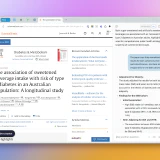
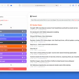
I Can't Stop Using Dia Browser
Dia’s seamless AI integration and polished interface are redefining the browser for me.

The Ode to Apple Notes
Apple's ecosystem of apps is great, especially if you're willing to use them exclusively. And Apple Notes is one of the best examples.
Finalist: A Simpler To-do App
Finalist is built for people who liked keeping all their tasks in Apple Notes but wanted it just a bit more structured.
Omnivore Review: An Underrated Read-Later App
I sometimes see people using Pocket, Instapaper, or Safari’s Reading List even though all of them have been practically abandoned and the first two definitely don’t deserve a subscription. I reviewed Readwise Reader and Matter earlier, but they only work properly if you pay. It’s not for everyone, so I wanted to tell you about Omnivore, a rapidly-developed read-later app.
I Wish Bear Hadn’t Wasted Years
Bear emerged as the flagship notes app, but then lost its lead because of technical debt. I doubt their latest update makes them competitive right now.
Raindrop Review: Better Bookmarks For Twitter And YouTube
Twitter, YouTube, and many other services have built-in bookmarks and playlists encouraging you to save content for later. I encourage you to try using a third-party service instead of them. Raindrop is a great alternative.
How to Read Newsletters In An App
Your email app isn't the best way to read newsletters. Especially if you're subscribed to dozens of them. Try a separate app for this.
How to Start a Personal Blog
A practical guide to starting a personal blog you can keep for years, without depending on social platforms or fragile tools.
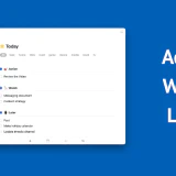
A Better Way to Keep Organize Your Tasks
Sharing my approach to categorizing tasks inside your task manager so you will not forget anything and will understand what you have to work on at any moment.
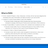
The PARA Method To Organize Your Work And Life
The PARA method is the most universal productivity technic. It’s very flexible and can be recreated in any app, whether it’s Notion, Workflowy, Apple Notes, Things 3, Roam Research, Evernote, or Todoist.

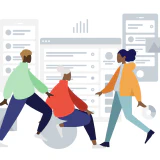
How to Work Remotely and Stay Sane
I’ve been working remotely for nine years now. I wouldn’t say it’s everyone’s future. There are pros and cons. For me personally, the advantages far outweigh the problems. If you ended up in a remote work arrangement, you might find these tips helpful.
Switch to a Modern Read-Later App Already
Read–later apps are simultaneously popular and outdated. A lot of people use them. They’re now embedded right in our browsers and there's a couple of age-old names, but if you’re still using any of these options you should reconsider.
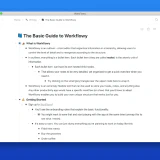
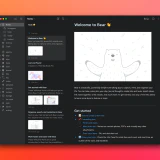
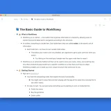
The Updated Guide to Workflowy
I've updated my guide to Workflowy, the king of outliners, which I wrote almost two years ago. Since then, Workflowy has added many great features, including rich media support and backlinks, so the previous iteration felt incomplete.
All the Ways to Keep Tasks
There are so many task managers because people have drastically different views on how to keep their tasks. I went over all primary ways that I've seen.
Mailbrew Review: Get Personalized Email Digests of News and Content
Mailbrew is the only app that allows you to receive news and content from the web in the form of regular digests. The idea behind it is to avoid the anxiety and guilt caused by endless feeds in social apps by doing bulk delivery of content at a pre-defined time throughout the day.
Feedbin Review: One App to Consume All News
It’s one thing to read a lot of content, it’s another to spend hours jumping between apps trying to get a dopamine hit and then getting caught in them. Feedbin is the best RSS service which collects RSS feeds, email newsletters, Twitter feeds, and YouTube videos.
Browsers Are Outdated And Somebody Has To Do Something
Our browsers are astoundingly outdated and their developers seem to be oblivious to that. We went from basic HTML pages sprinkled with a little bit of Javascript to running full-scale applications like Figma or Descript yet browsers have practically the same UI as they had ten years ago.
There Is An Empty Space In Team Productivity
At all of my jobs we used different tools for project management: from Asana to Notion and Todoist Business. I've also looked at Monday, Trello, Flow, Taskade, and others. Still, none of them can match a personal task manager.
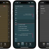
A Comparative Review of iOS Browsers
I compared all third-party iOS browsers to check if they're ready to be used as default ones. Only if you really want to.
The PARA Method in Workflowy
PARA is a universal productivity methodology that can be implemented in any app or service. It helps you categorize your notes, thoughts, documents, and files.
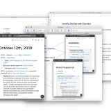
The Ultimate Guide to Workflowy
Workflowy is the ultimate productivity app that closely mimicks the way I want to work. It might be overwhelming at first, so I wrote a guide that covers all the basics.
The Evolution of Outliners
Outliners are apps which force you to write in hierarhical bullet points, helping you to structure your thoughts They are are a very curious category of software products that have been mostly used by a small number of geeks but recently captured more attention with the launch of Roam Research.